With the guidance of DOXA's Daniel Bertalotto, I created an identity system for STNDRD, a Chicago-based clothing company that focuses on unraveling the ethical shortcomings of the fashion sector. While big fast-fashion brands like H&M and Gap contribute to climate change by purveying inexpensive pieces that fall apart or fall out of style in a season or two, STNDRD aims to provide sustainably-sourced clothing that lasts for years. Although the company is fictional, I approached the project as one would a real client: I worked from a brief with strict deadlines for deliverables, with Daniel serving as a representative of the company.
DISCIPLINES
Identity, illustration, print, UX, social media
TOOLS
Adobe Illustrator, InDesign, Photoshop, and XD
INITIAL BRAND RESEARCH
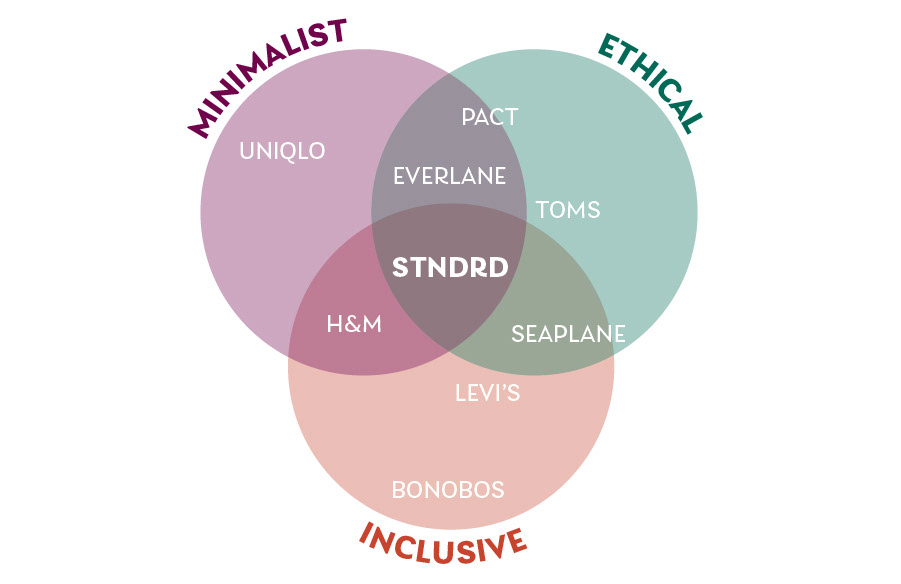
I started with the overarching characteristics that STNDRD strove to embody: ethics in production, an inclusive attitude, and a minimalist design philosophy. Plenty of brands out there fit one or two of those traits, but few manage to straddle all three.
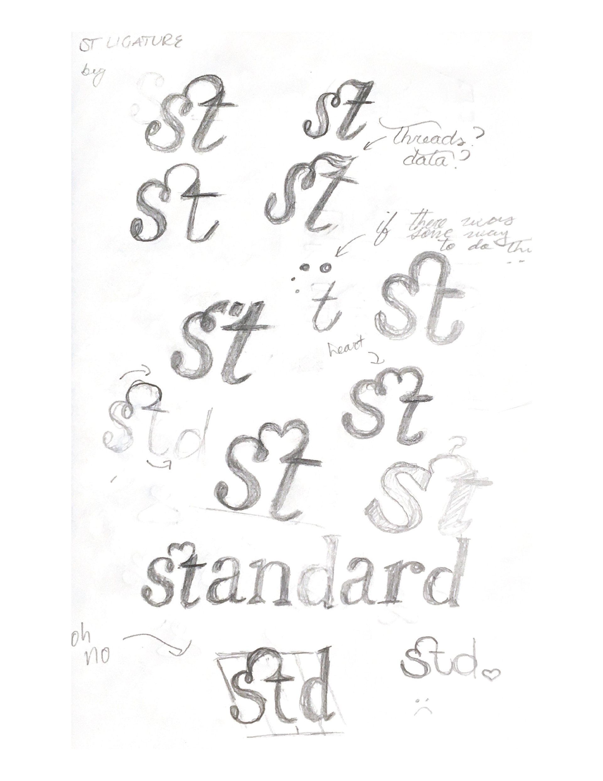
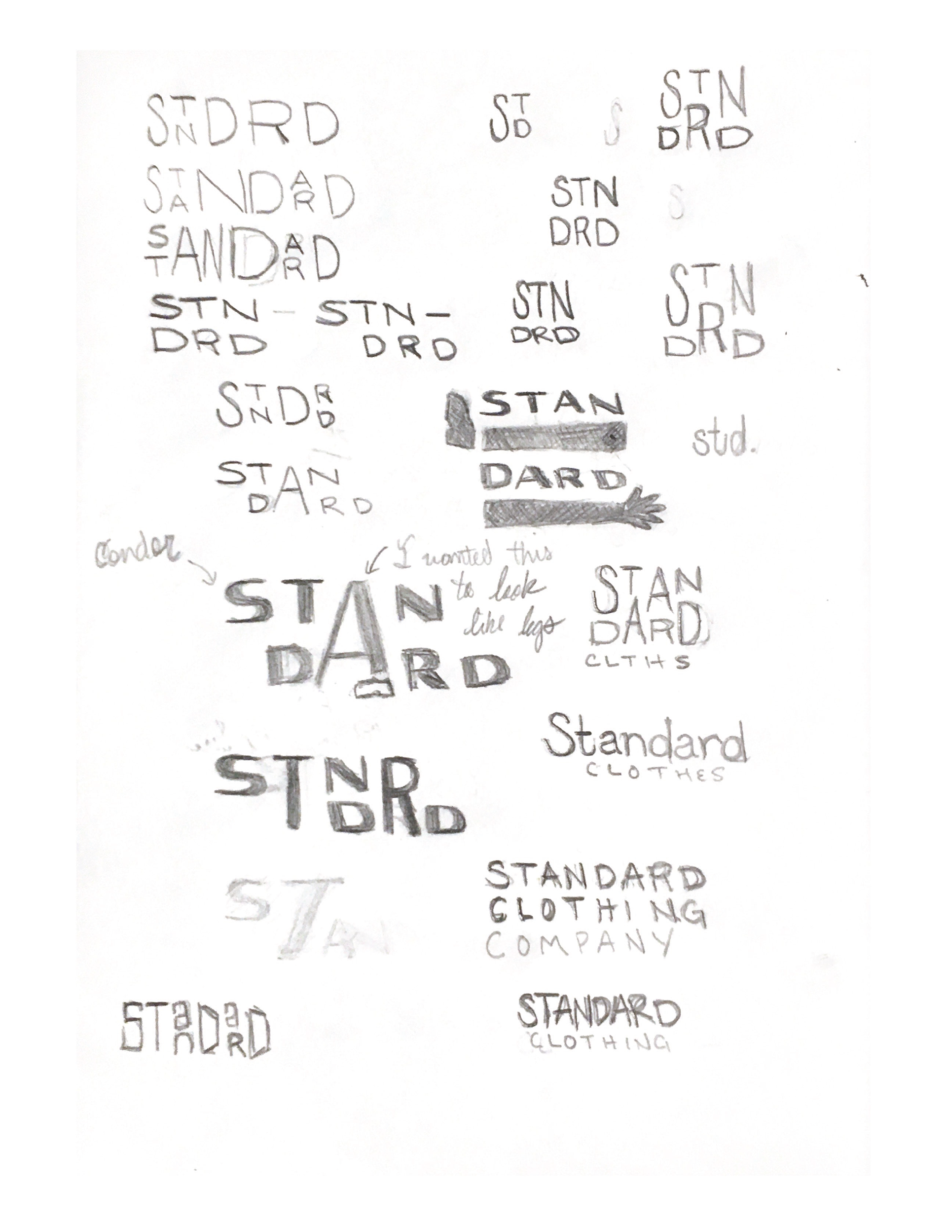
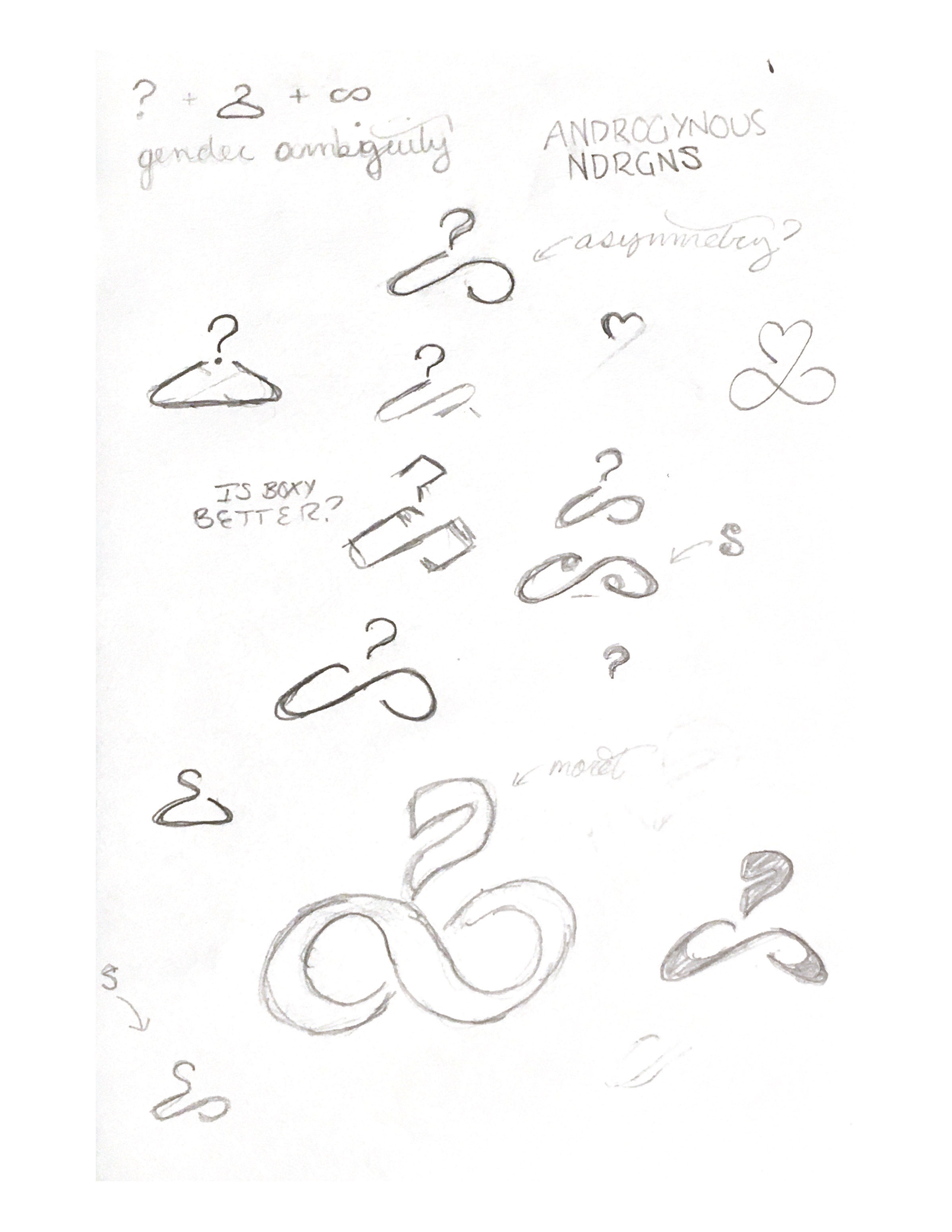
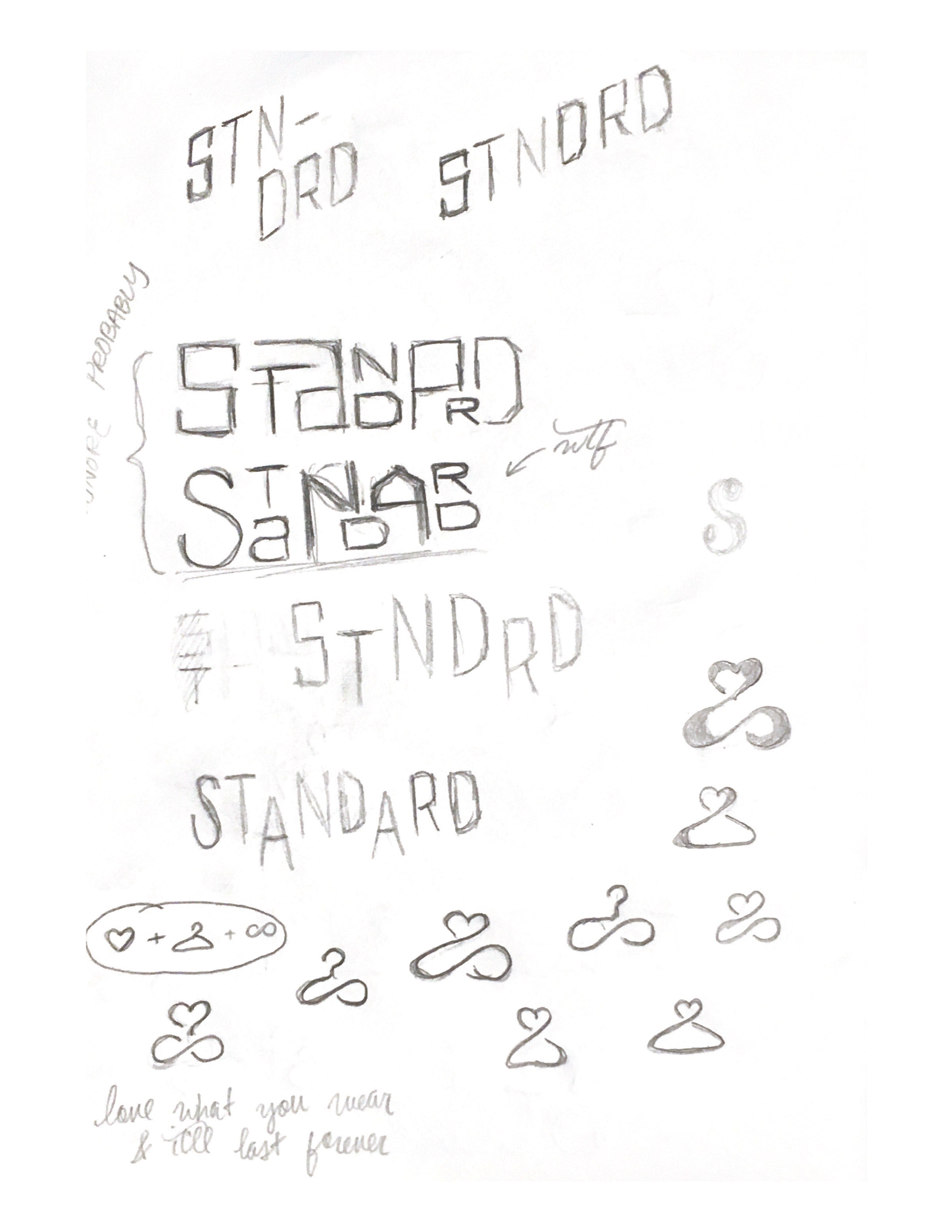
Initial logo sketches explored ligatures, modular stacking, arms and legs, hearts, hangers, and infinity symbols. I eventually landed on...
LOGO
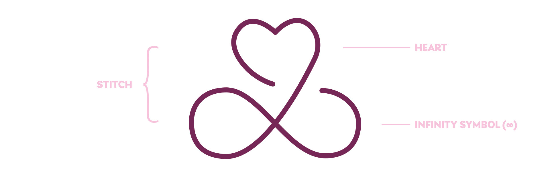
The final mark combines a heart and an infinity symbol (∞) into a simple, compact, symmetrical symbol that resembles a stitching shape. This reinforces the tagline I wrote for the brand — "Clothes you'll love forever" — very intuitively.
(It happens to resemble a clover leaf, too, which fits Chicago's vibrant celebration of Saint Patrick's Day.)
(It happens to resemble a clover leaf, too, which fits Chicago's vibrant celebration of Saint Patrick's Day.)
One of the core tenants that I live by in designing a mark is that it should be simple enough that a child could draw it from memory, much like the North American Vexillological Association recommends for flags. A brand is doing its job when we can recreate it quickly in our head: Nike's 'swoosh', McDonald's 'golden arches', Amazon's arrow.

The mark can be combined with the wordmark, which is set in the lovely Laca (which I later chose for my website). The thread of the mark weaves in and around the letterforms, reinforcing the idea that it represents a stitch.

When rendered in a single color, negative space is added around the thread and letterforms to maintain legibility.
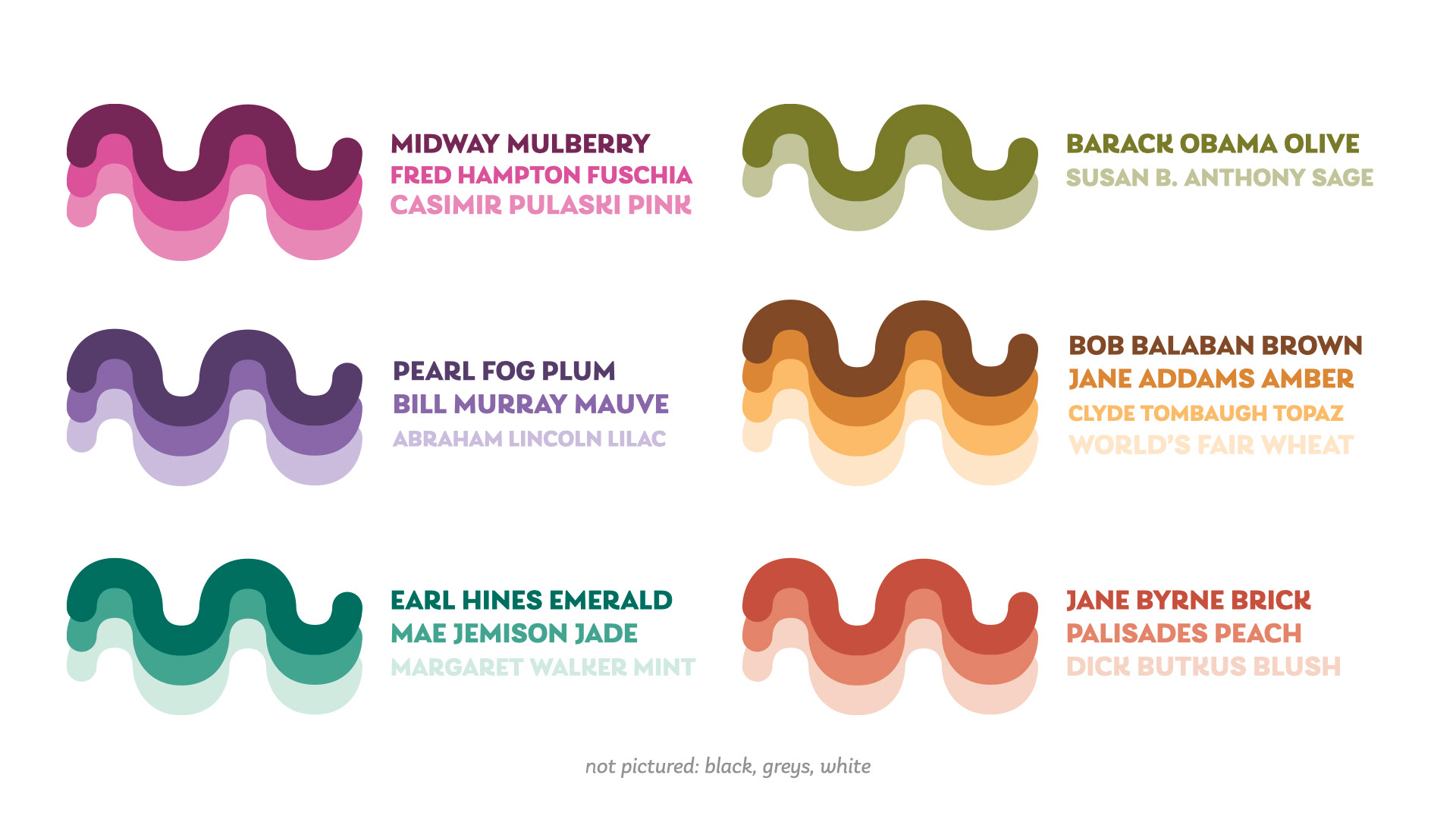
As a clothing company that boasts close relationships to prominent designers, STNDRD needs a large color palette both for brand elements and its products themselves. Each main hue in the palette lies a notch or two away from a conventional color of the rainbow, allowing the company the show its commitment to diversity in a distinctive, eye-catching way.
The name of each color in the palette pays tribute to an important figure or event in Chicago's rich history. Alliteratively.
(Unabashedly inspired by Sufjan Stevens' Illinois.)
(Unabashedly inspired by Sufjan Stevens' Illinois.)
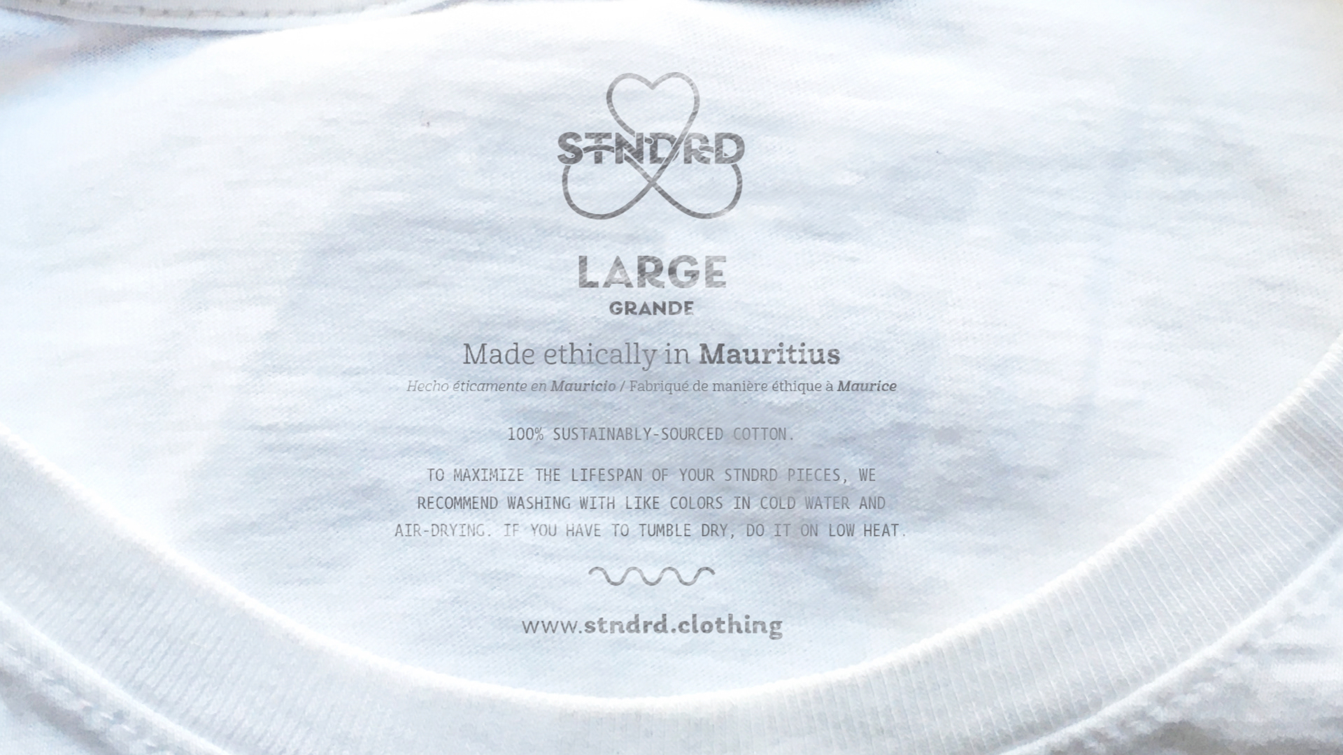
APPLICATIONS / T-SHIRT LABEL
Here, the single-color wordmark sits atop size, production, and care information. This label bucks a few conventions of clothing tags. Printing directly on the inside of the garment saves a little bit of material, is more comfortable for the wearer, and lessens the chance that the information ever becomes separated from the clothing. Care information is written in plain, approachable language wherever possible. STNDRD's website is listed at the bottom of the label to give the piece's owner quick access to more information about materials and care.
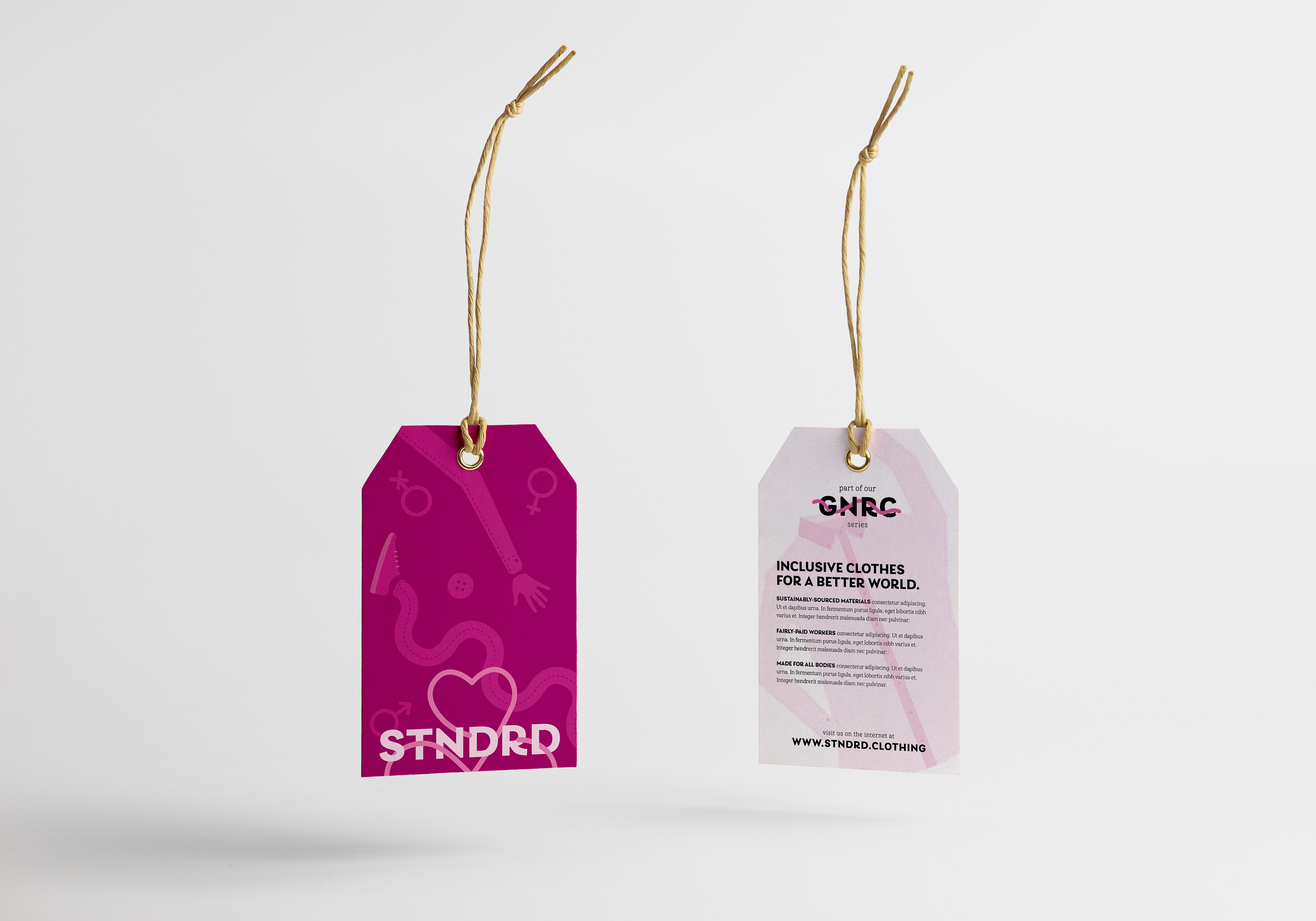
PAPER TAGS
External paper tags show off brand elements (like simple, wacky illustrations) brightly and boldly. On the reverse side, the name of the garment series is entangled in a thread, referring back to the logo lockup; the company's commitment to sustainability, ethics, and inclusivity is briefly explained below. As STNDRD intends to sell their goods at pop-up shops, its tags should draw in new customers and tell its story and values in an engaging way.
WEB
STNDRD's web presence features a statement of values front-and-center on the homepage. Pieces are categorized into 'masculine', 'feminine', and 'neutral' shops to help people of all gender identities feel welcome. Product pages are very simple and prominently feature care information and those quirky color names, much like the brand's physical labels do.

POP-UP SHOP SIGNAGE
Though primarily driven by e-commerce, STNDRD intends to run pop-up shops in big cities from time to time. Window appliqués like this one can be quickly and easily applied and removed, and don't take up space in a busy walkway like a tent sign would. This application uses the single-color version of the logo lockup, and the POP-UP SHOP text is interwoven with clothed arms and legs to recall that hallmark of the brand.
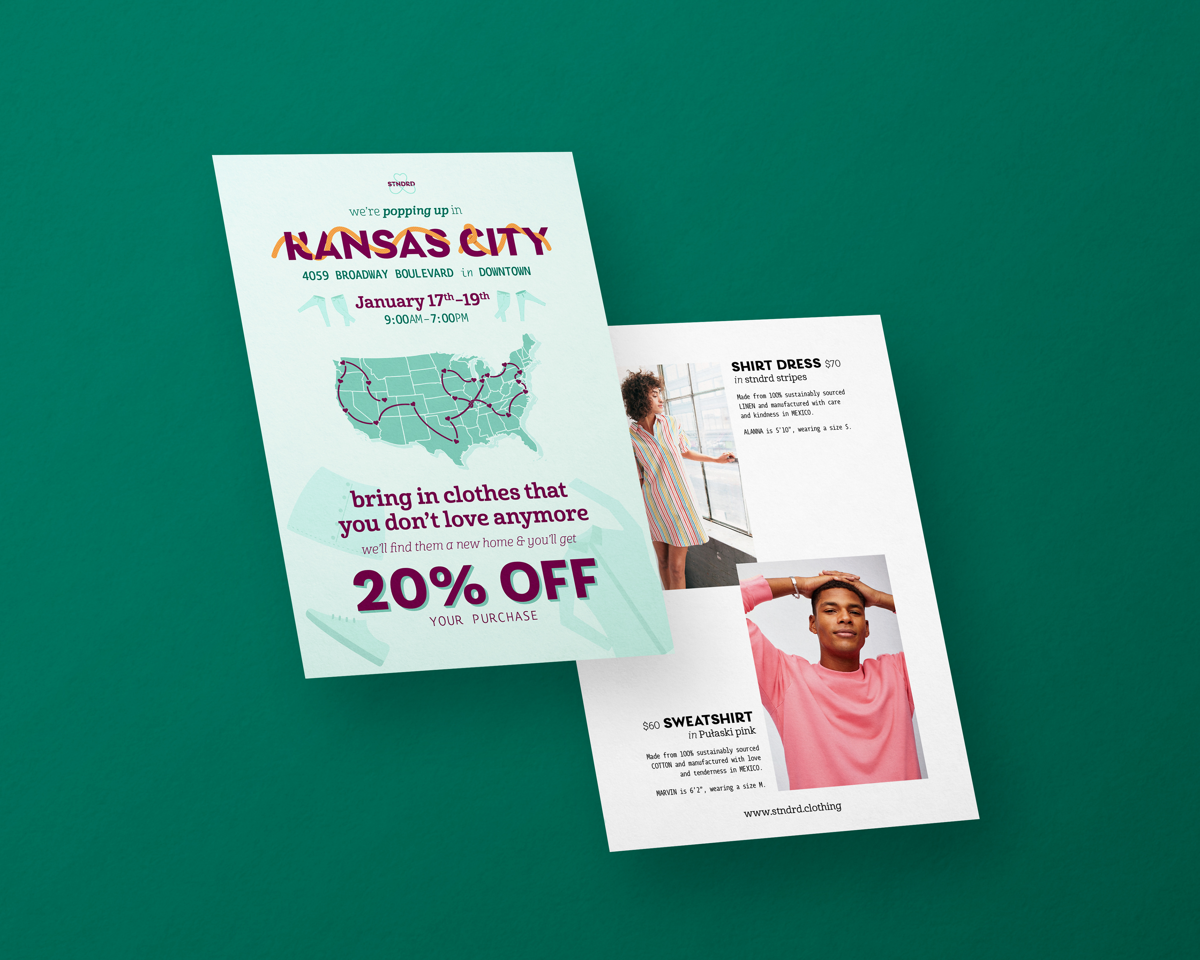
MAILER
This simple postcard-size mailer advertises a pop-up shop event where you can bring in old clothes to be recycled. Illustrations of "posed" clothing add a spontaneous human character throughout brand applications. A couple staple pieces are shown off on the reverse side.
Product photos throughout this project from H&M, Bonobos, and Everlane; used for academic purposes only.
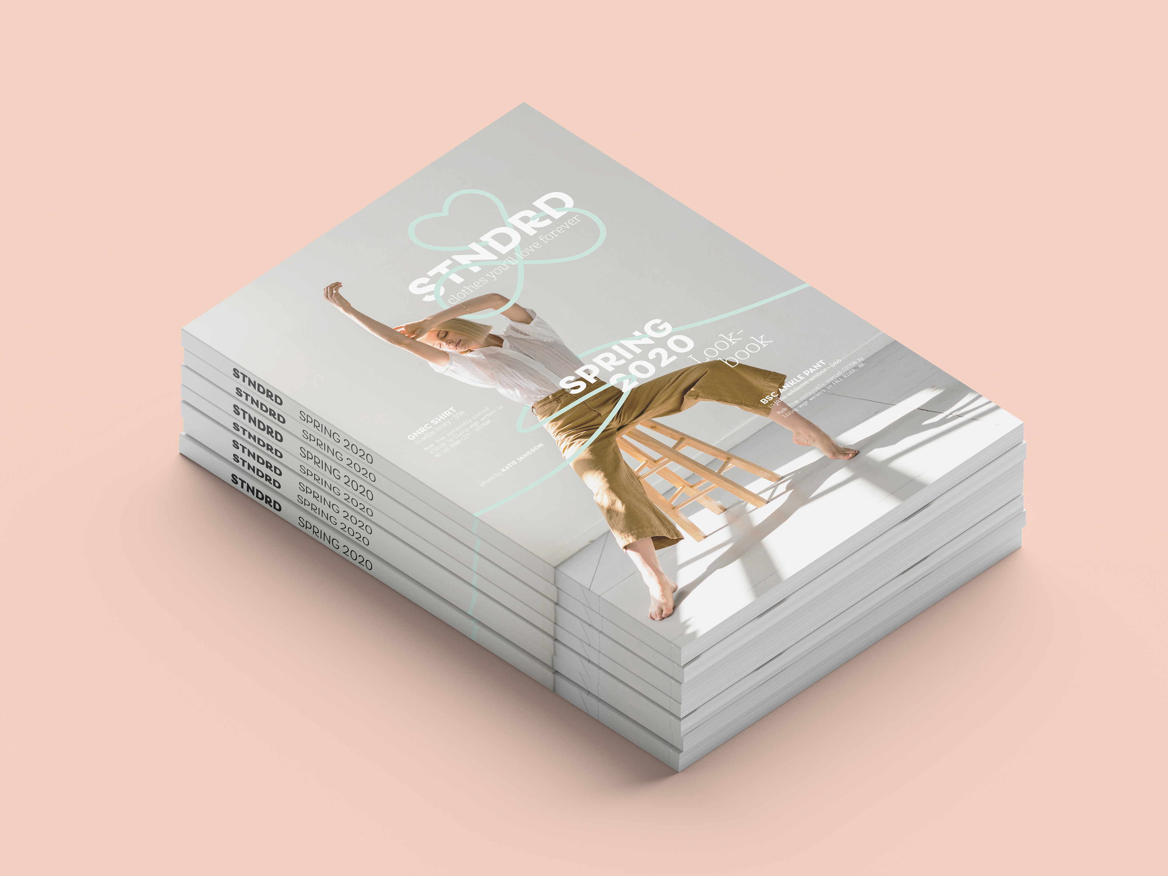
LOOKBOOK
This lookbook cover concept wouldn't be possible without stunning photography by Katie Jameson. Photo used for academic purposes only.
Here, the brand's hallmark threads wrap around the cover model, as does the typography. The color palette proves itself capable of a neutral, airy spring vibe.
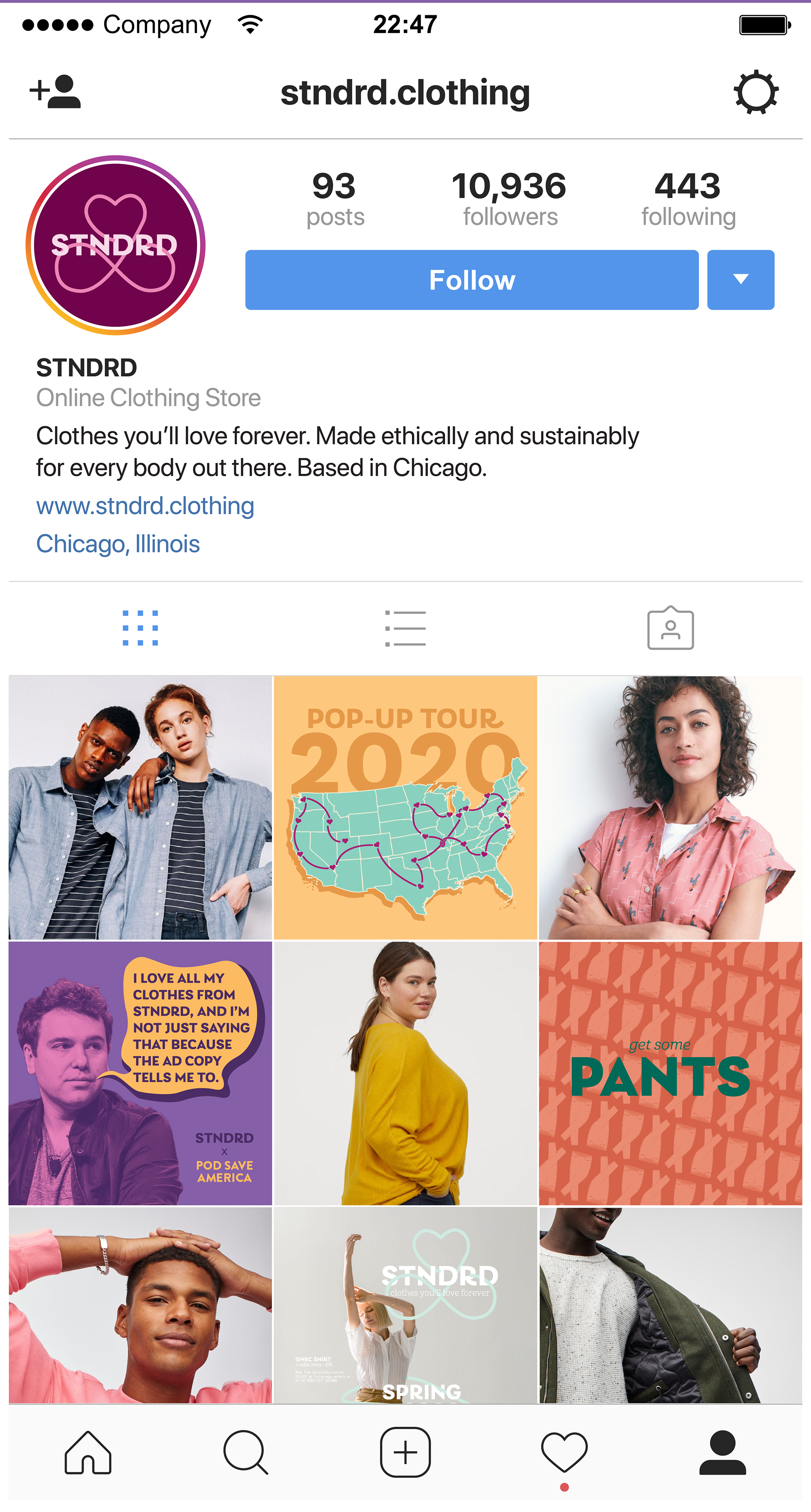
SOCIAL MEDIA
Social media allows for the fast and loose application of color, type, illustration, and photography. The more the boundaries are pushed, the better. The STNDRD mark fits naturally in the circular profile photo crop of most most social media sites.
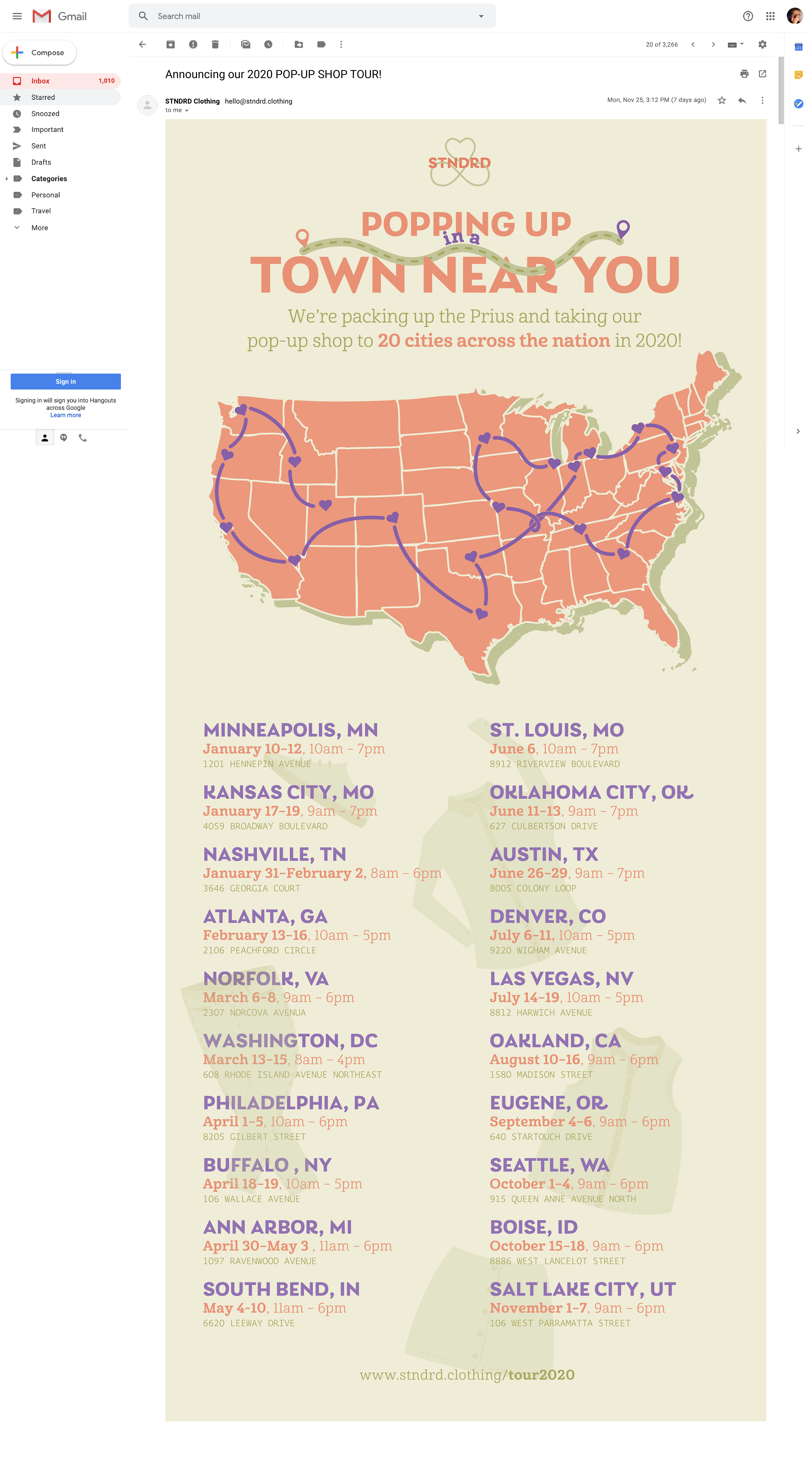
EMAIL BLAST
This email blast was my favorite part of the STNDRD brand to work on; I think it really shows off the flexibility of the color palette, type, and illustration style. This could also be adapted to a print poster format.
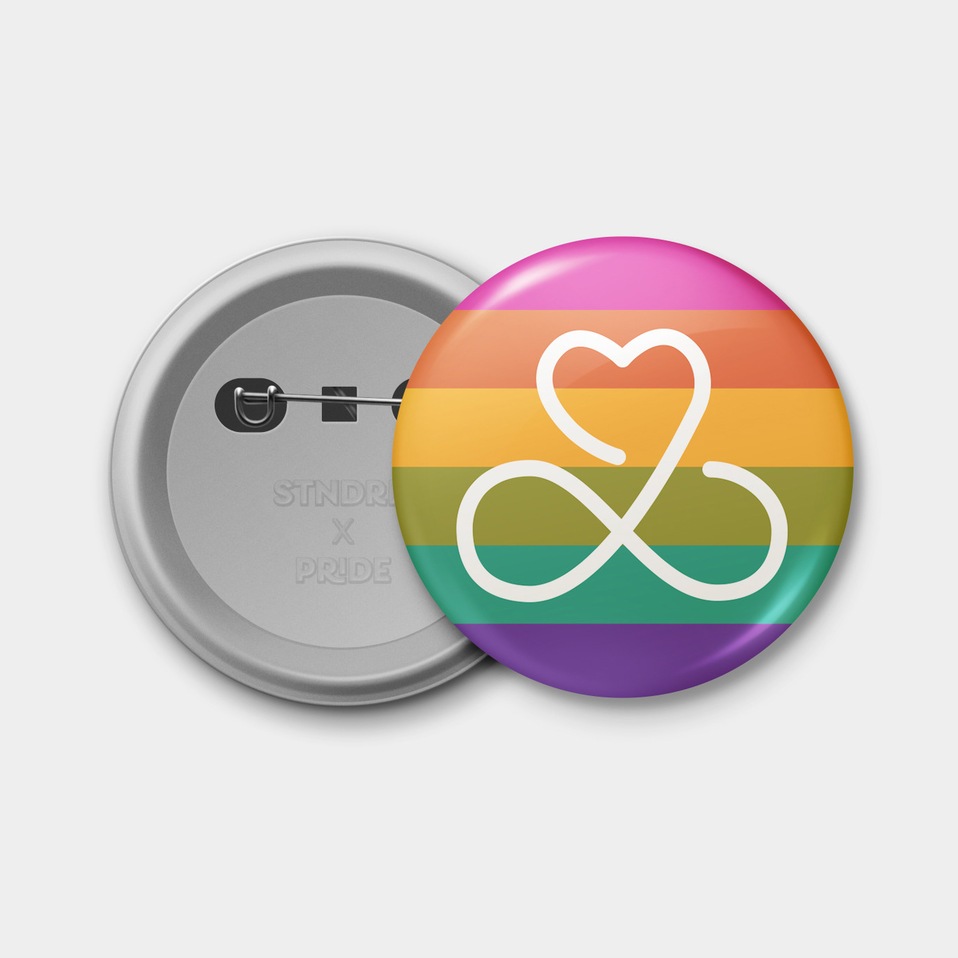
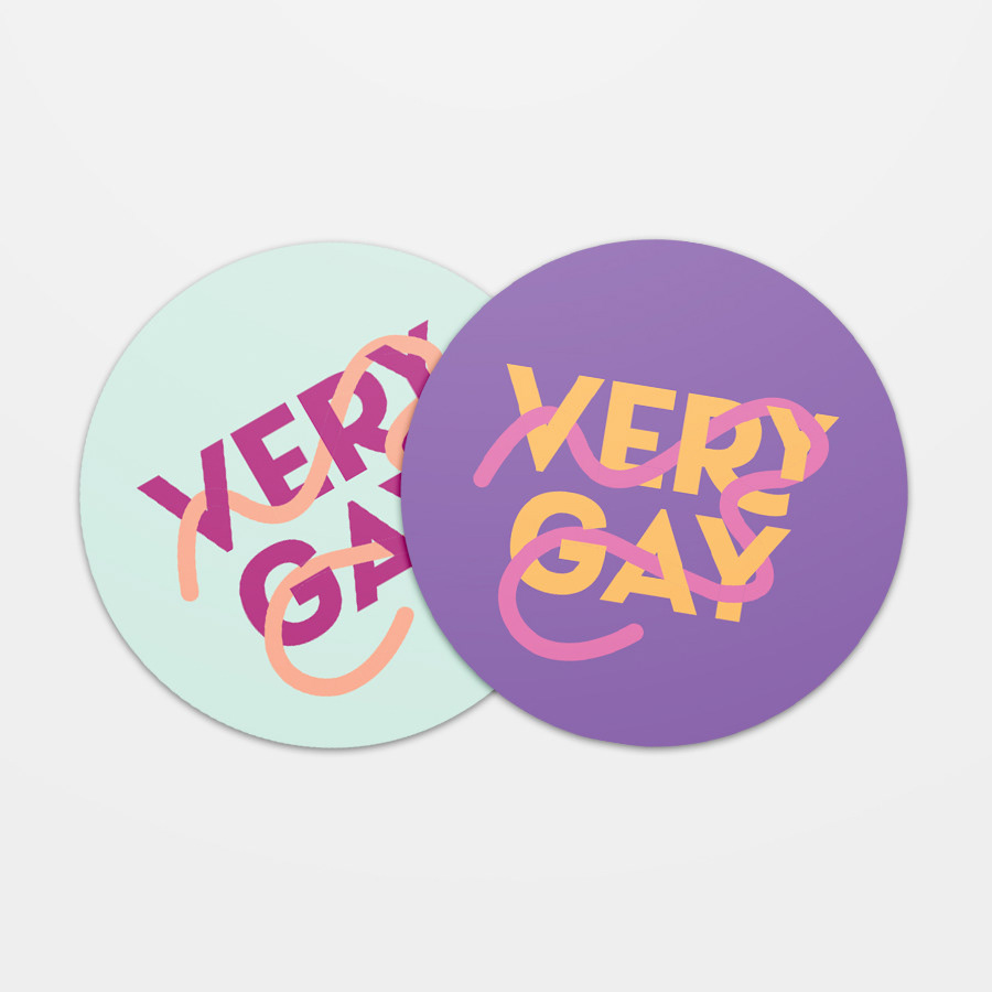
PRIDE MERCH
Finally, a simple Pride Month sticker and button make use of STNDRD's unique rainbow palette, Laca's stacking OpenType features, and the meandering thread in the logo.
Thanks to Daniel and my wonderful CLASSMATES at the University of Arkansas for their input and support throughout this project.