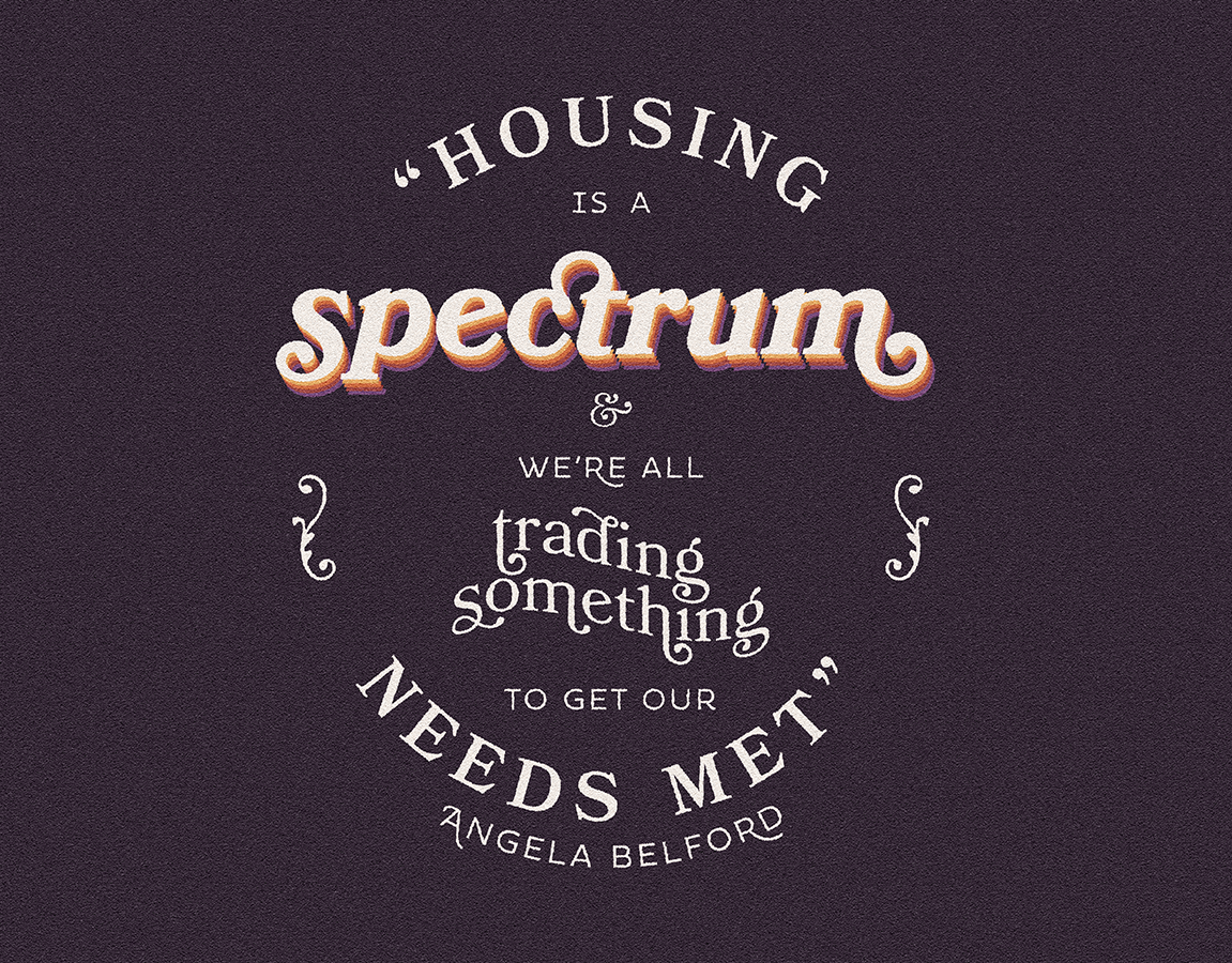
Remember the pre-pandemic world? Yeah, me neither. Conifer, a Chicago-based market research agency, set out to find people who do remember how they lived before COVID-19 turned modern existence into a gauntlet of Zoom calls and nasal swabs. They surveyed and/or interviewed 1,664 people across the United States and compiled the results into a huge and fascinating report on Americans' indoor and outdoor activities over the past 3 years. The main takeaway: we used to be hermits. We still are (and it's gotten even worse, actually), but we used to be, too.
They typed up their big report into a Google Doc, handed it to me (as an employee at Little Bird Marketing), and asked me to make it pretty and digestible and full of spiffy data visualizations, a la Vox's The Year, Explained, In 4 weeks.
So I did. In 3 weeks.
SKILLS
Editorial design, data visualization
Editorial design, data visualization
TOOLS
Adobe InDesign, Photoshop, and Illustrator
Adobe InDesign, Photoshop, and Illustrator
VISUAL LANGUAGE
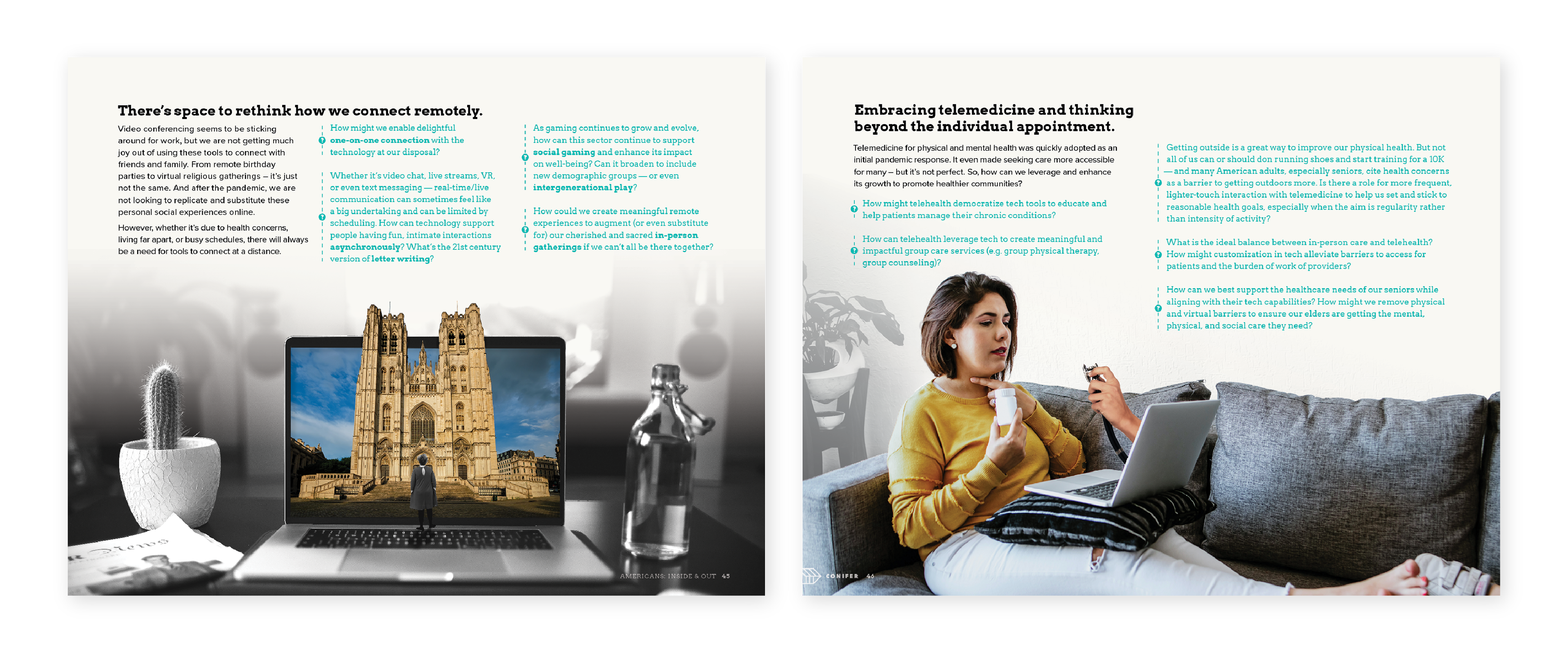
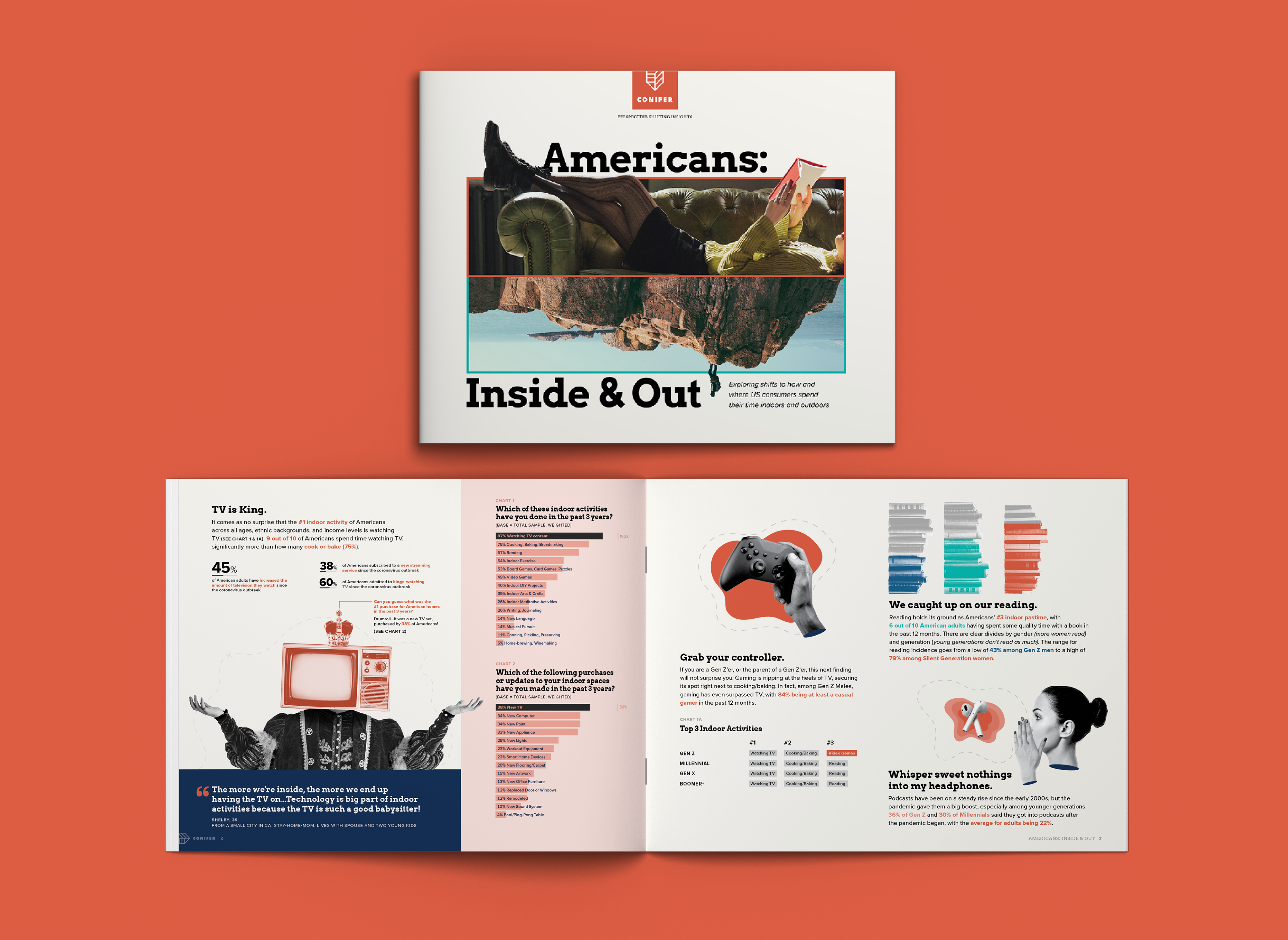
A report this long (49 pages) and dense (30+ charts) would be a chore to design for (let alone read!) if it wasn't written by an agency like Conifer. Their incisive personality shines through every word. It's witty and irreverent, yet incredibly insightful — they manage to make Americans' gardening habits captivating by breaking up all the text with catchy titles and sharp cultural references.
In keeping with the rest of my work for Conifer — particularly their lovely blog — Americans: Inside & Out is loosely inspired by the early Pop Art scene. Nearly every page is covered in collaged-together stock photos dredged from the catacombs of Adobe Stock. To drain them of their disarming, sterile cheesiness, I passed most of them through a high-contrast black-and-white gradient map. Paired with the Conifer identity's bright colors and cartographic vector elements (like loose, organic topographic map blobs), the overall visual effect is an intended corniness, somewhere between a 1950s home appliance catalog and a Risograph zine, that matches Conifer's sharp writing.
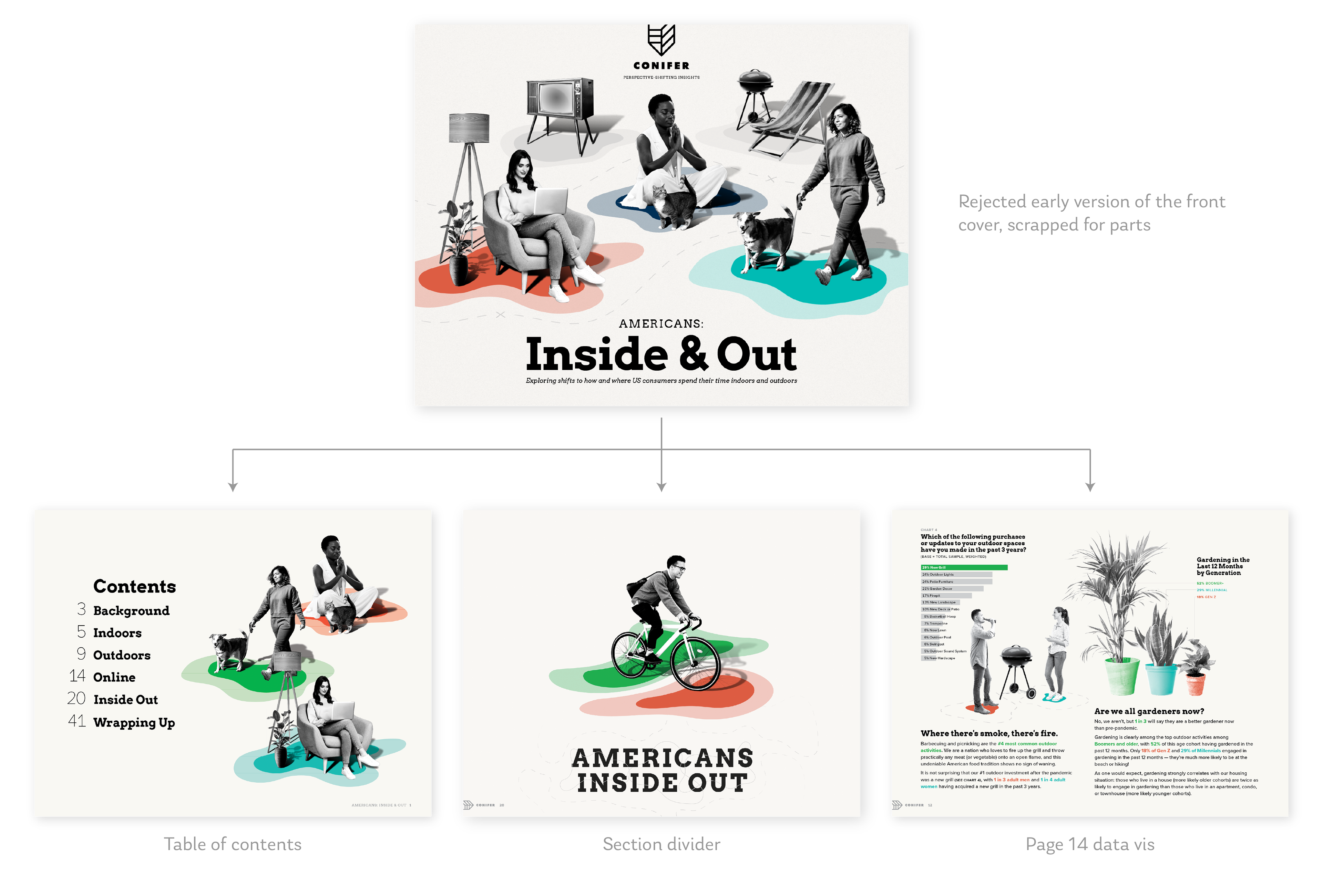
This early draft of the front cover (below) ultimately wasn't used, but it informed the design of the entire report. I used shitty stock photos and tried to cobble them into coherent "scenes", often tying it all together with topographic blobs and dotted lines. The 3 big "areas" of the report — indoor, outdoor, and online activities — became color-coded, and those organic topographic shapes became simple (but more-interesting-than-usual) pie charts in a few spots.
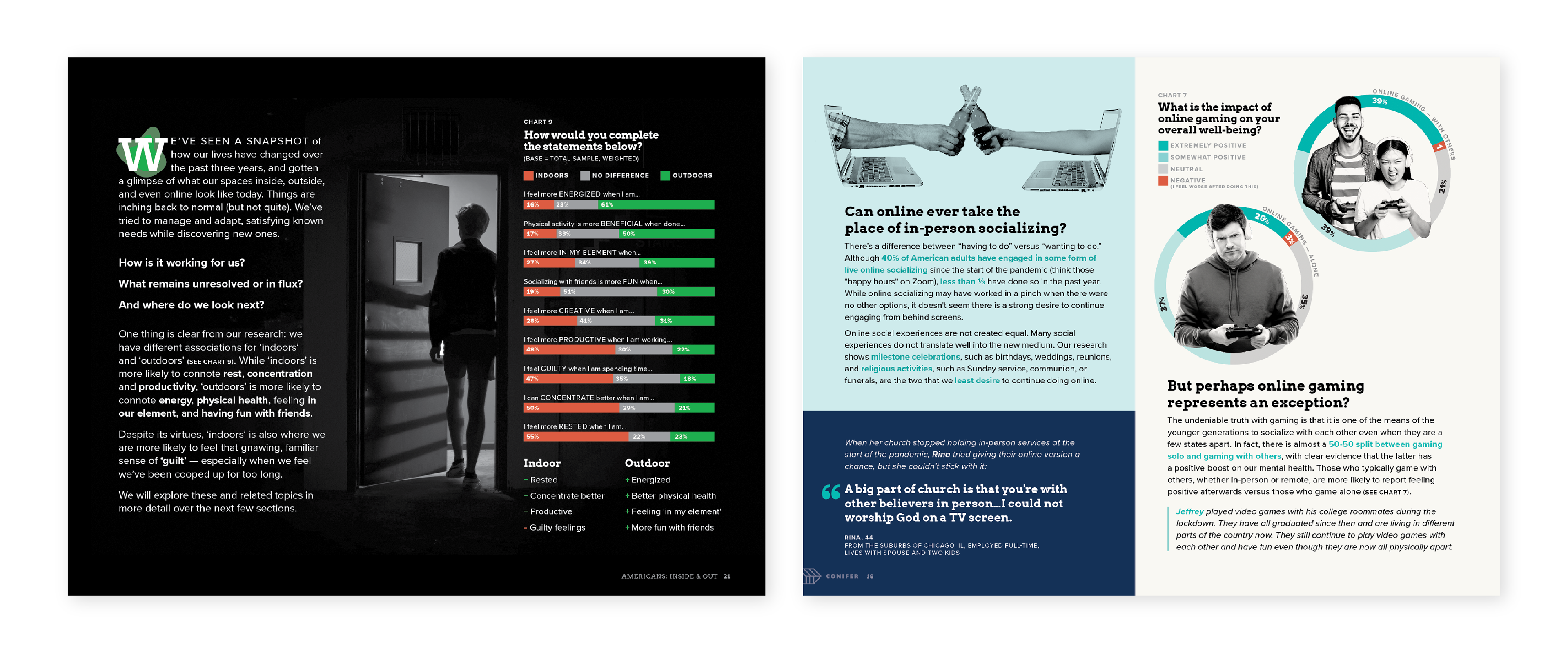
ONE MAN'S TRASH...
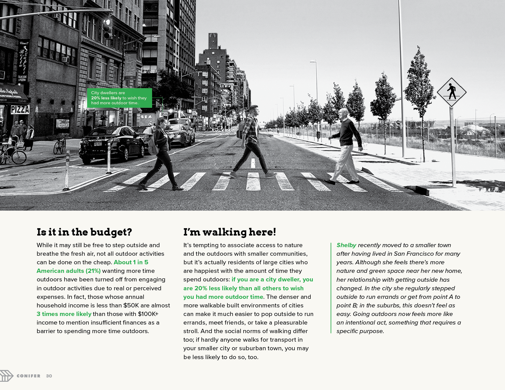
This collage on page 30 (below) is one of my favorites, and it exemplifies the mindset with which I designed the whole book. No stock photo was too corny or dated or sterile: it could be made into a semi-cohesive collage if it felt just right.
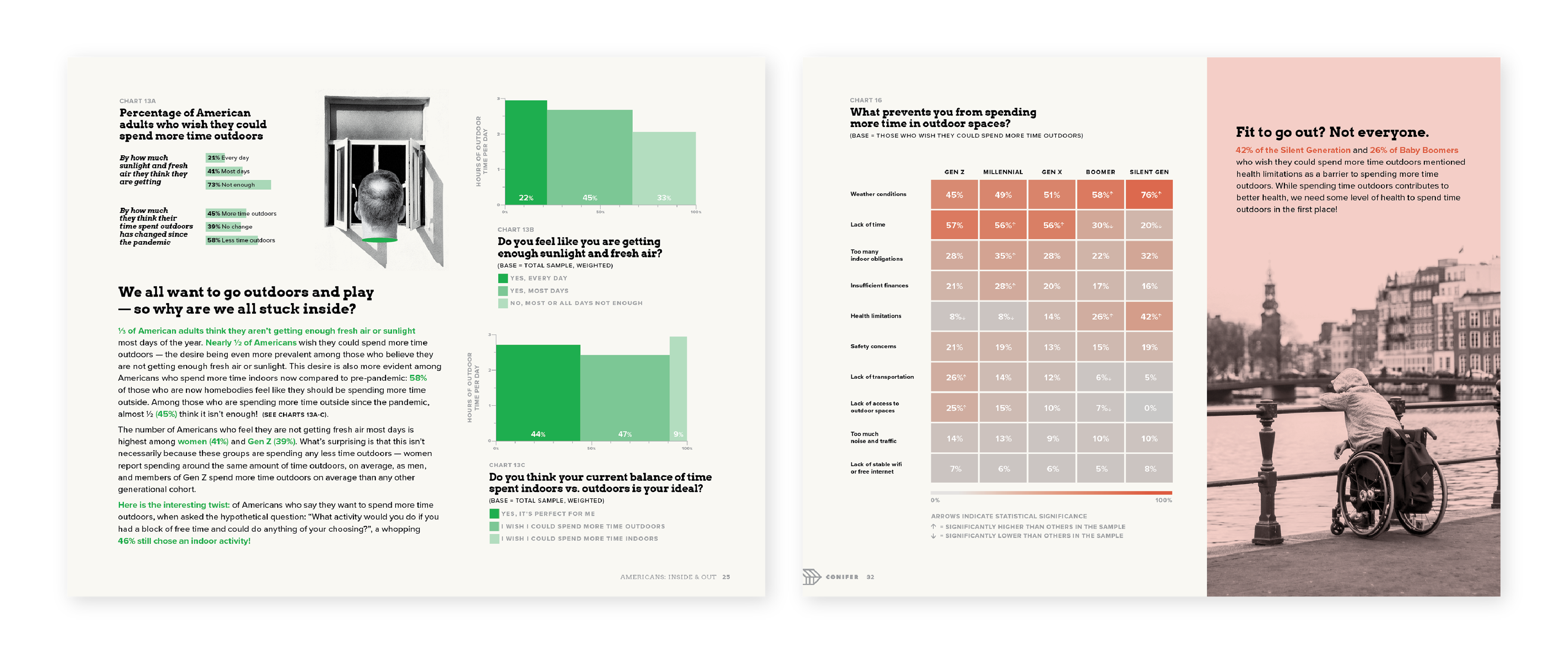
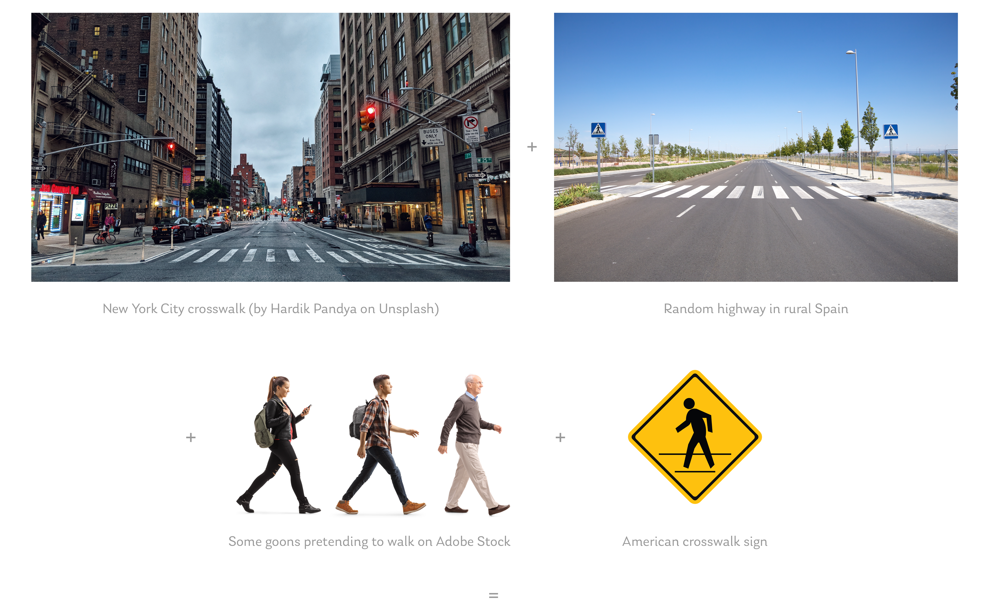
To illustrate an eye-opening fact from this page (that city dwellers are 20% more likely to be satisfied with the amount of time they spend outdoors than those who live in rural areas), I combined photos of crosswalks in New York City and rural Spain into a single scene. The effect is both subtle and startling — a dense urban atmosphere turns into a sparse rural one as soon as it crosses the dividing line down the middle of the road.
A FEW MORE SELECTED PAGES
All in all, I collaged together or otherwise manipulated over 100 photos for this report. There are some 36 data visualizations, ranging from bar graphs to Marimekko charts to heat maps.
The report exists in printed and digital forms (via download from Conifer's website). The project also included adapting various pieces of the report into graphics for social media and emails.