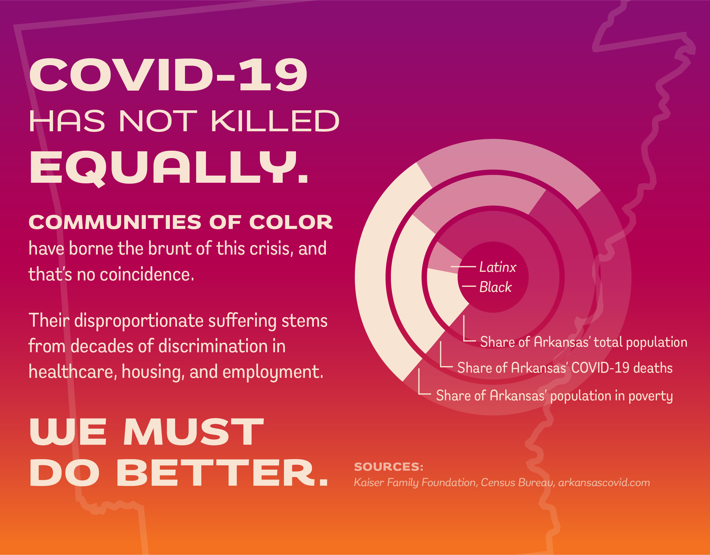
With the guidance of DOXA's Daniel Bertalotto, I created an identity system for James Lewis Butcher & Deli, a mom-and-pop chop shop located in Northwest Arkansas. Although the company is fictional, I approached the project as one would a real client: I worked from a brief with strict deadlines for deliverables, with Daniel serving as a representative of the company.
DISCIPLINES
Identity, print, UX, social media
TOOLS
Adobe Illustrator, InDesign, Photoshop, and XD
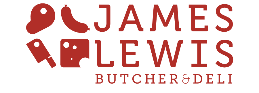
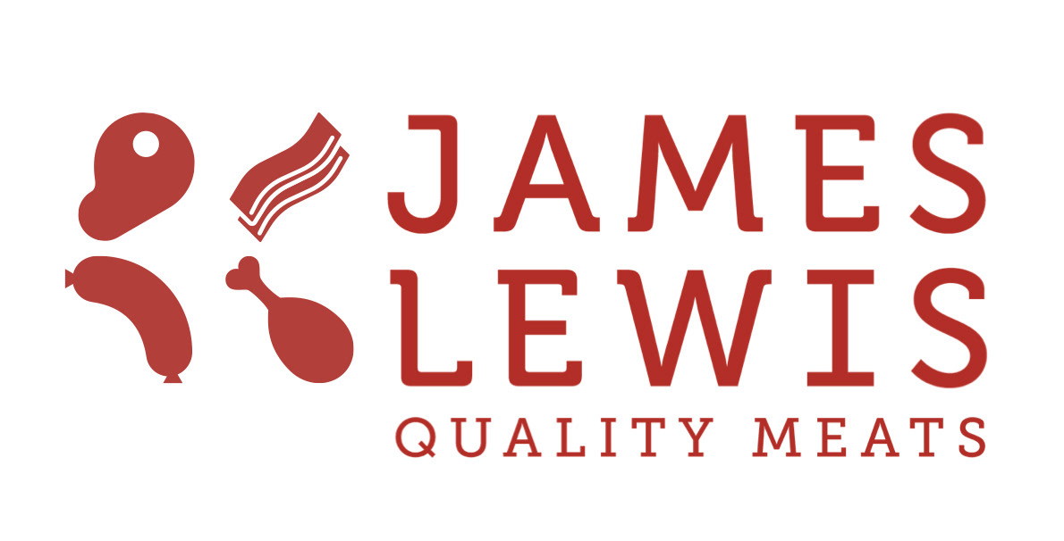
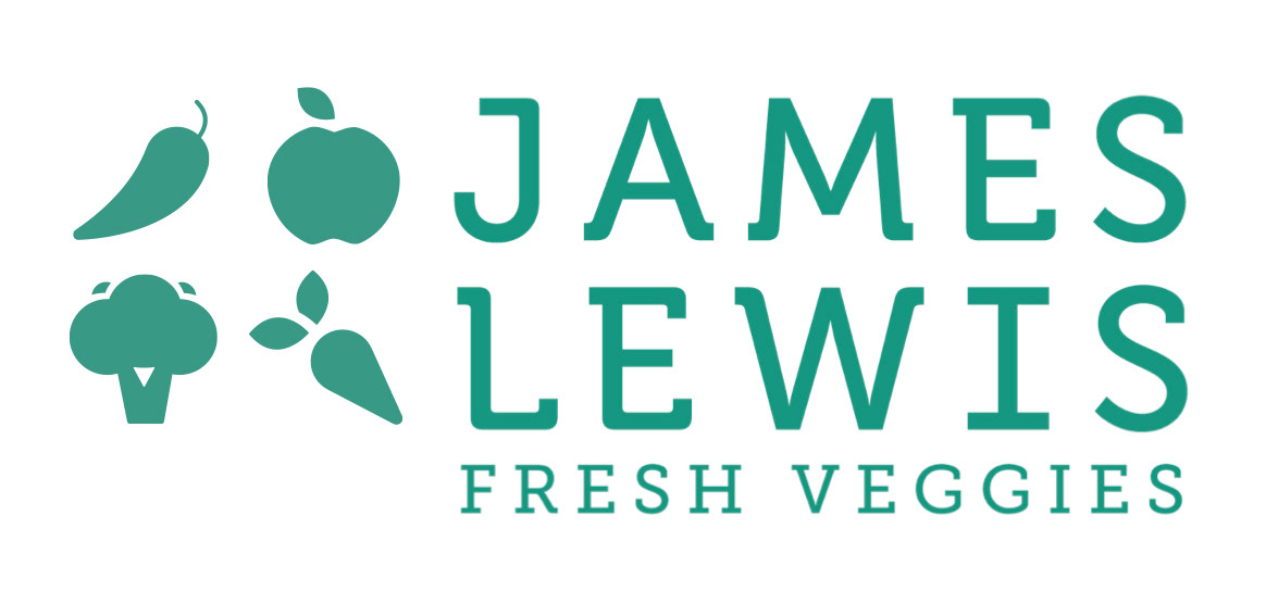
MODULAR LOGO APPROACH
This logo exists in a square grid used pretty strictly in most elements of the brand. The mark can consist of any four icons in the family of 30+ geometric icons that I made to accompany this identity. The result is a more modular and flexible approach to an identity system that lives in harmony with its surroundings on a menu, label, poster, or social media post.
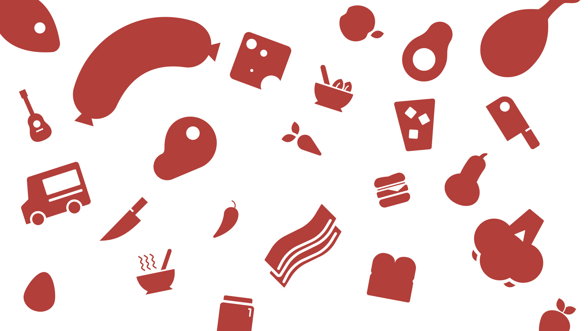
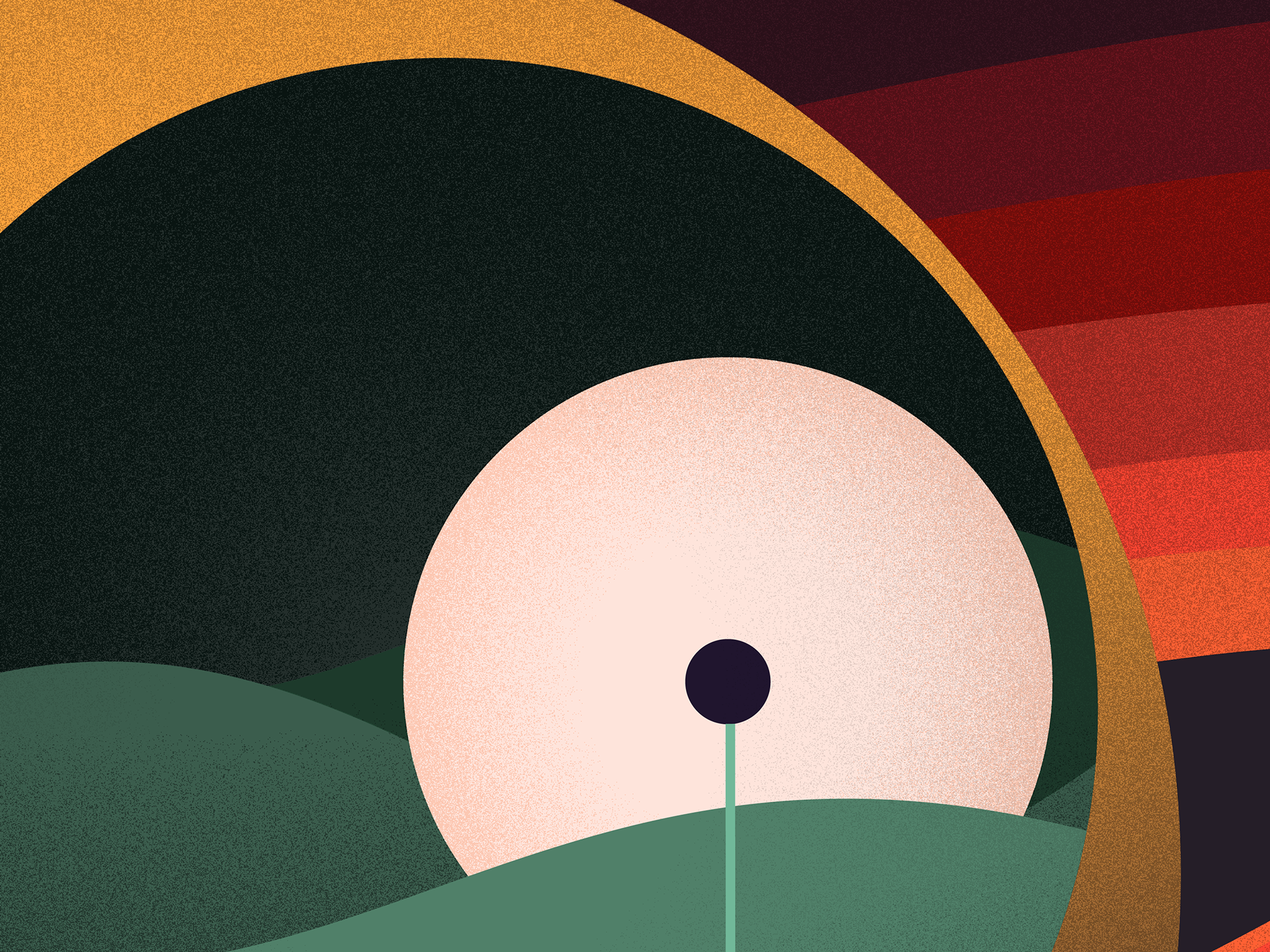
I created a set of over 30 geometric icons spanning the breadth goods that the deli offers, from meats and veggies to jams to food trucks. Each icon has a filled and an outlined version in each of the four colors of the identity — red, green, gold, and indigo.
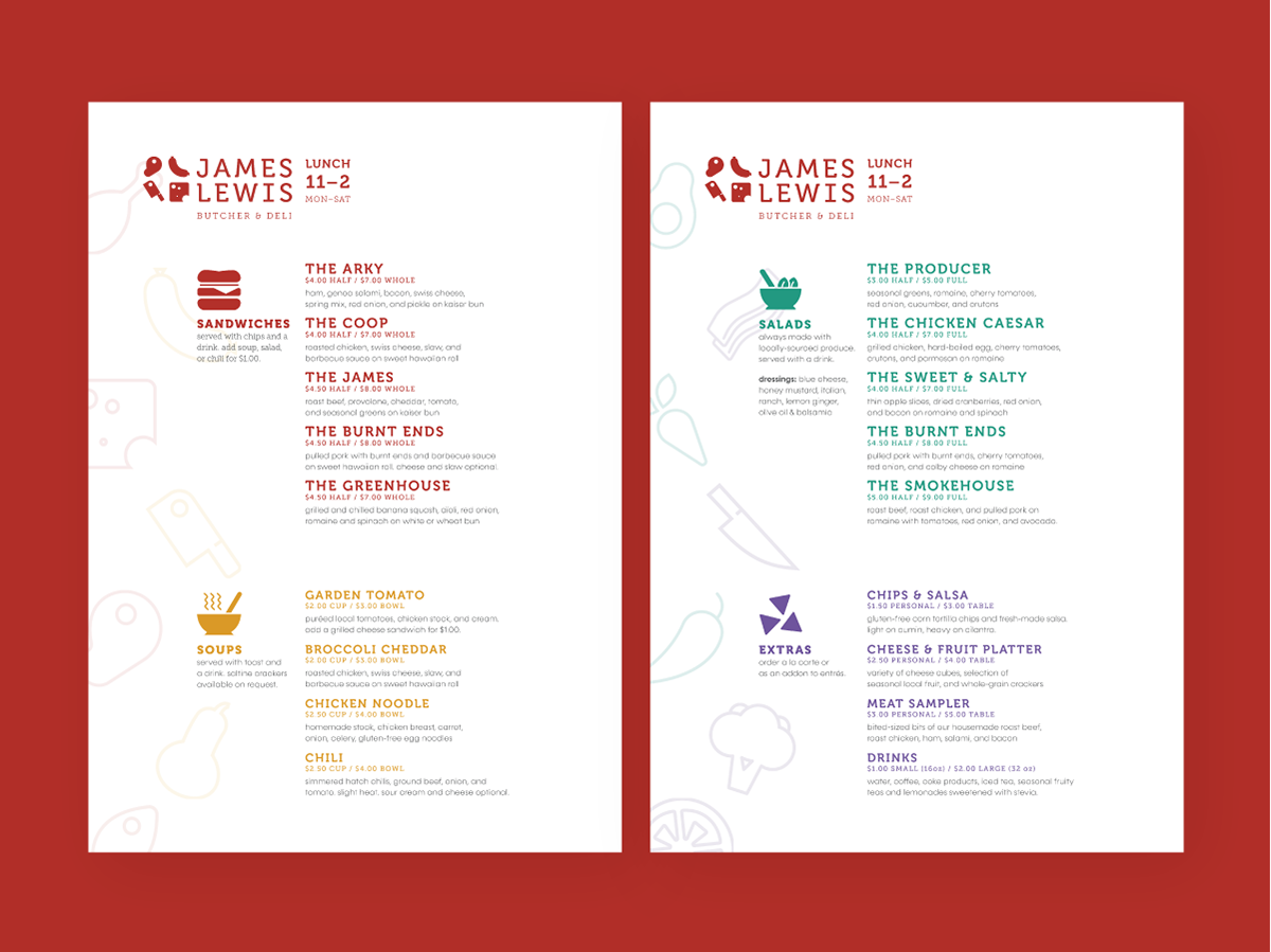
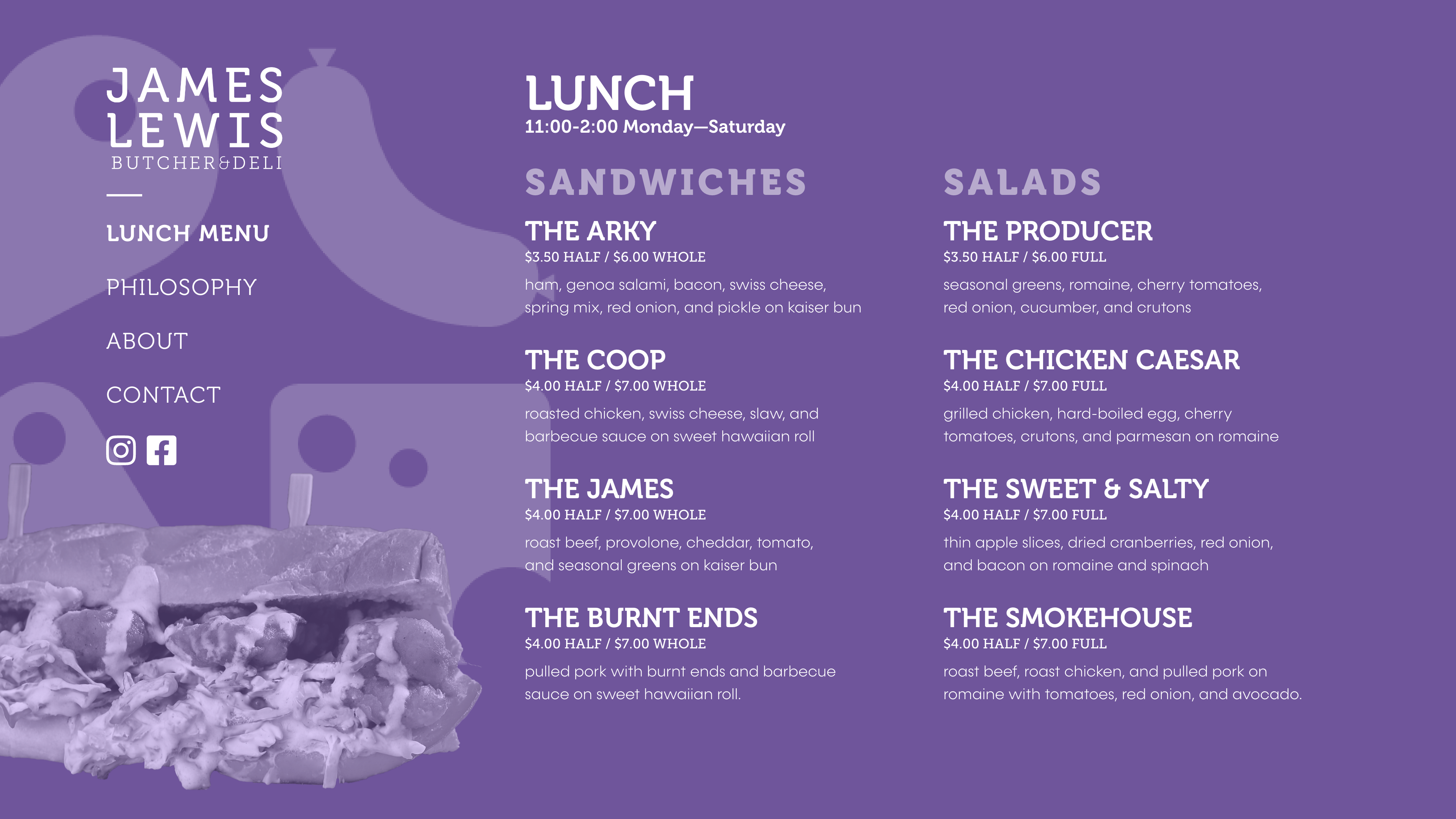
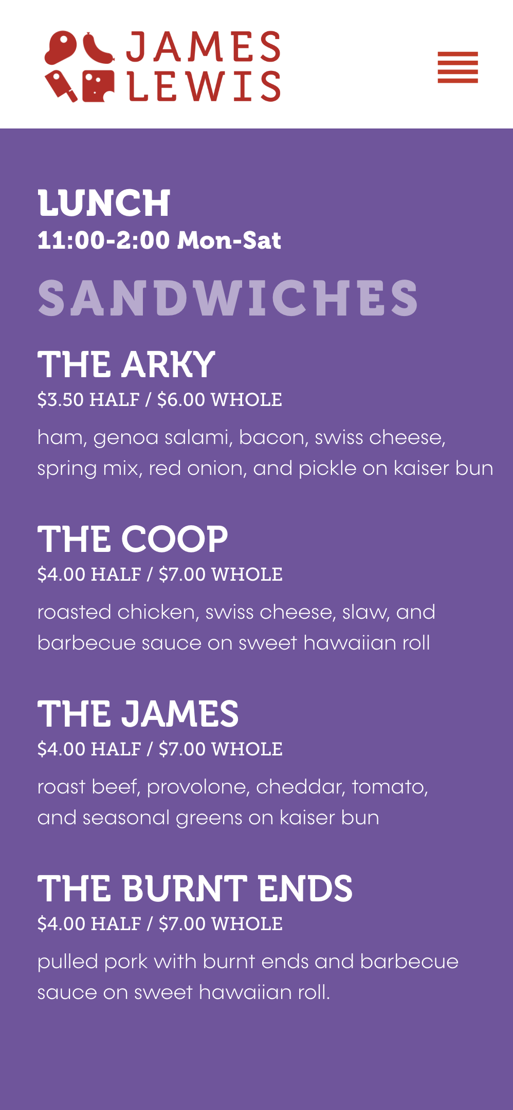
This 7 3/8" by 10 3/8" menu uses the same square grid that shapes the logo — at this size, the grid is 8 columns wide by 12 rows tall. I used both filled and outlined versions of the icon family in all four primary colors of the brand's palette. Section headings sit in a separate column from menu items to add clarity and readability (so it's easier for readers to spot all the list of salad dressings, for example).
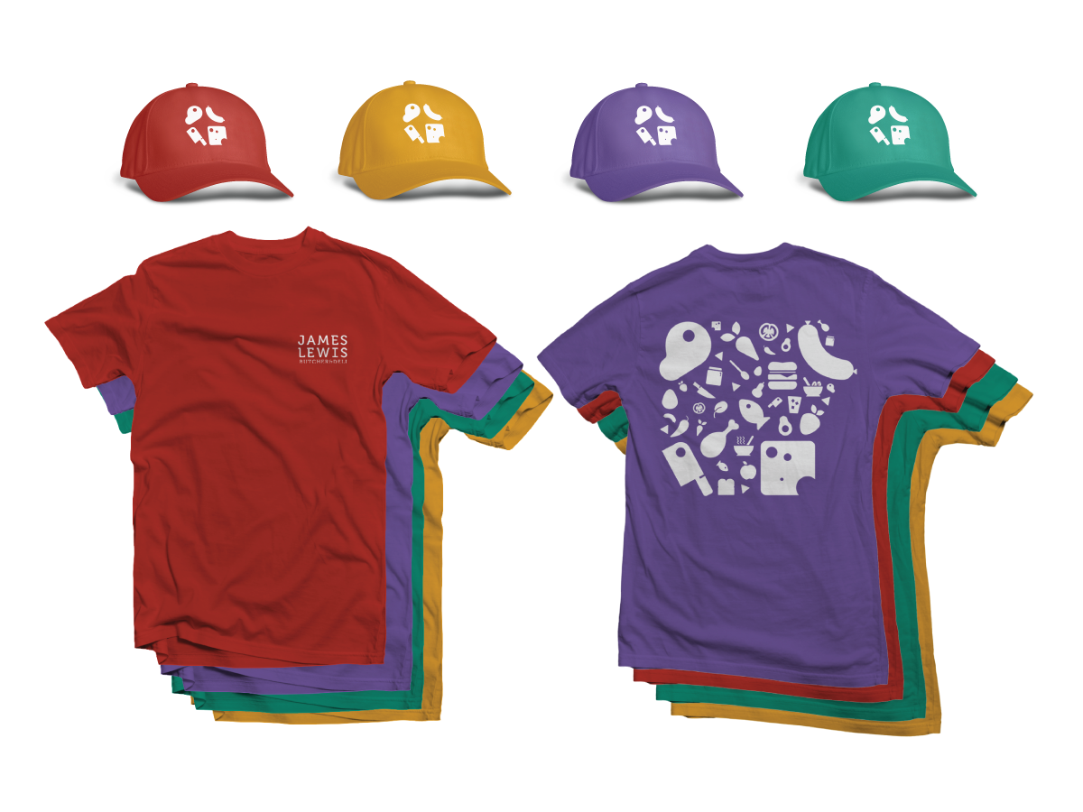
WEARABLES
The front of the shirt features the wordmark on its own. For the reverse side, I arranged all the icons in the shape of Arkansas, while keeping the main four icons (steak, sausage, cheese, cleaver) in their same position and orientation as they are in the logo.
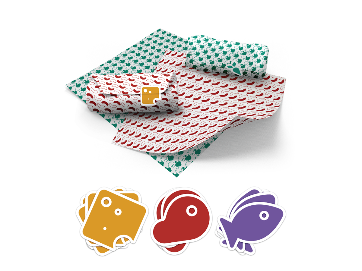
PACKAGING
Patterned butcher paper and stickers keep sandwiches straight and ward off the evils of cross-contamination. The icons are repurposed to create fun, stylish patterns.
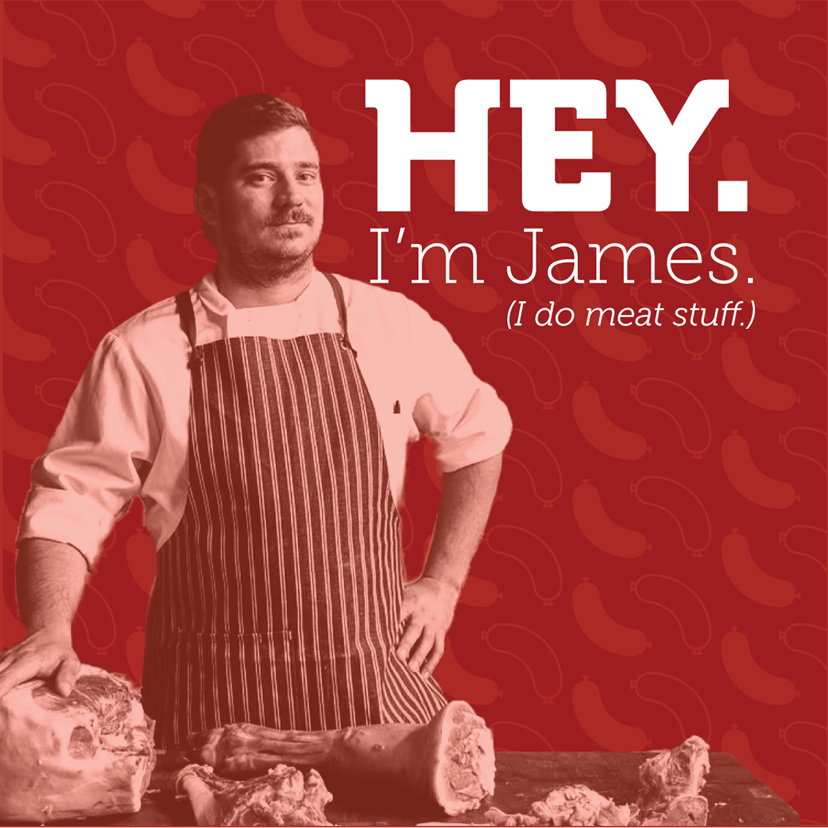
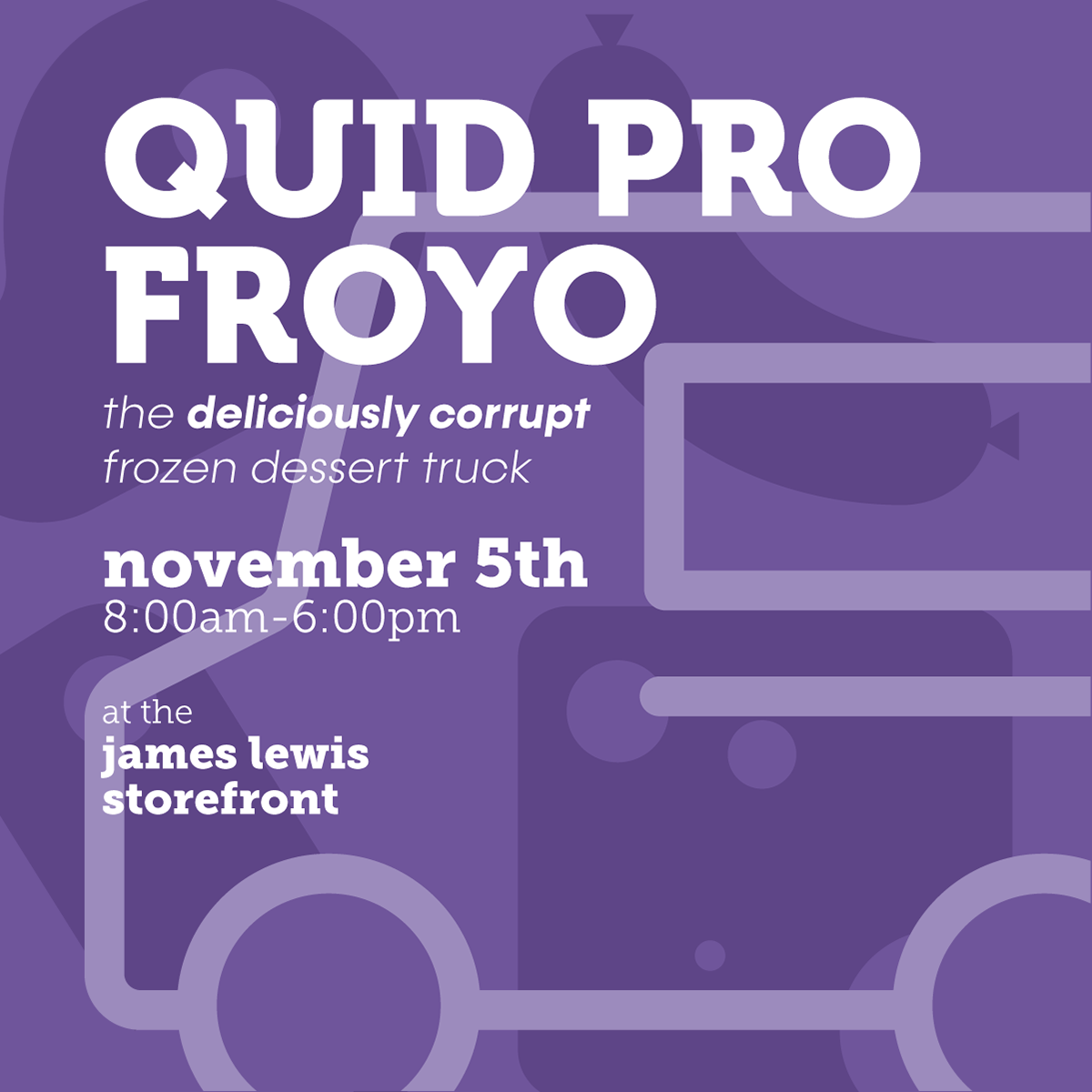

SOCIAL MEDIA
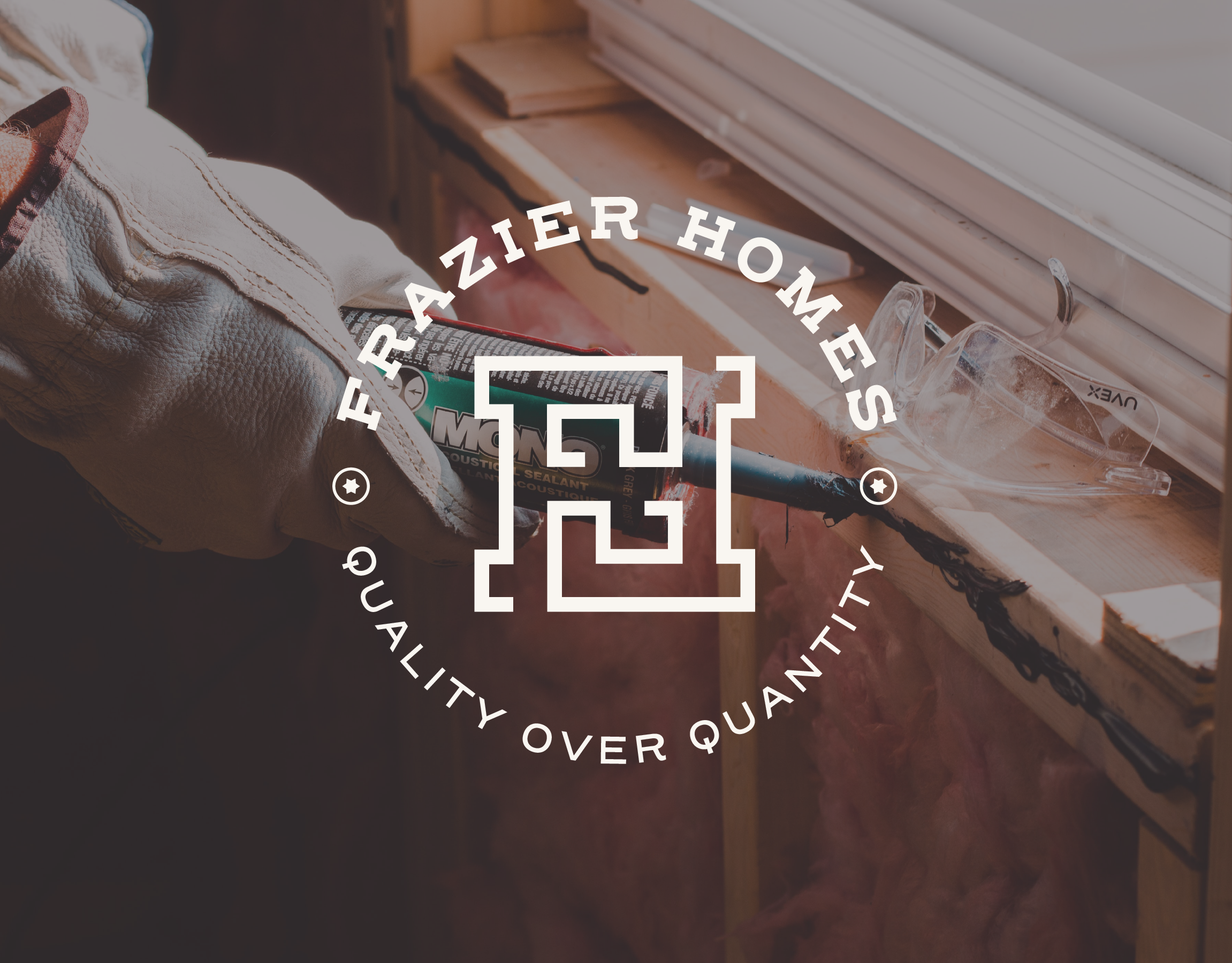
The social media image strategy is fast, loose, and quirky; the brand's geometric icons take center stage. Photos live in duotone to bring greater attention to high-contrast type.
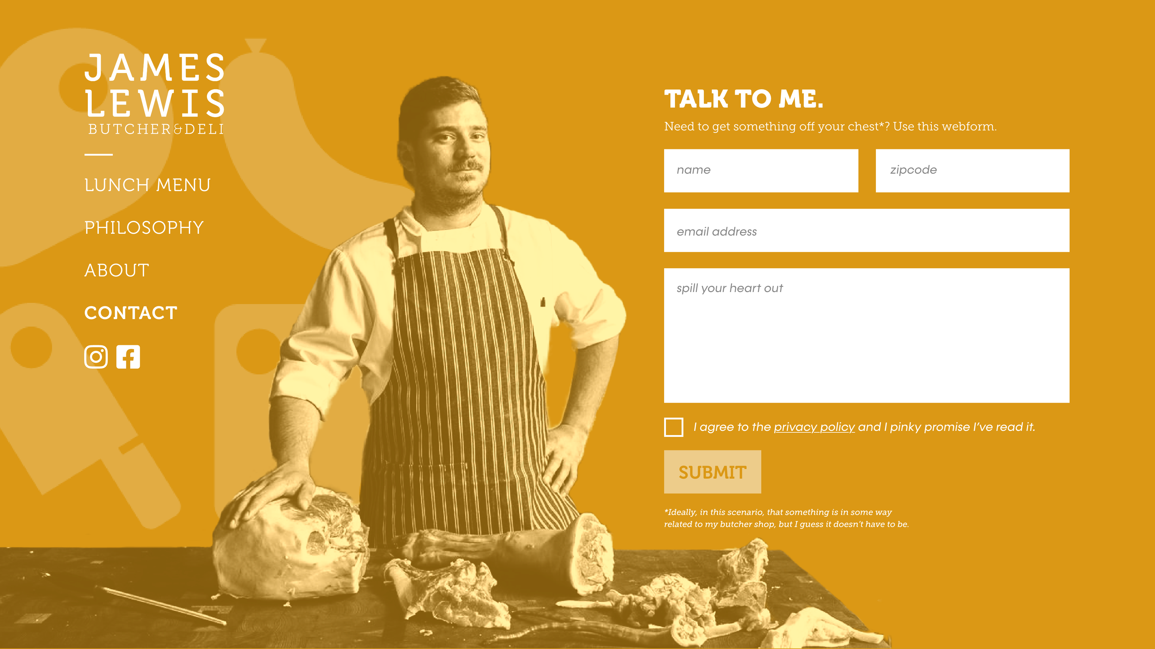
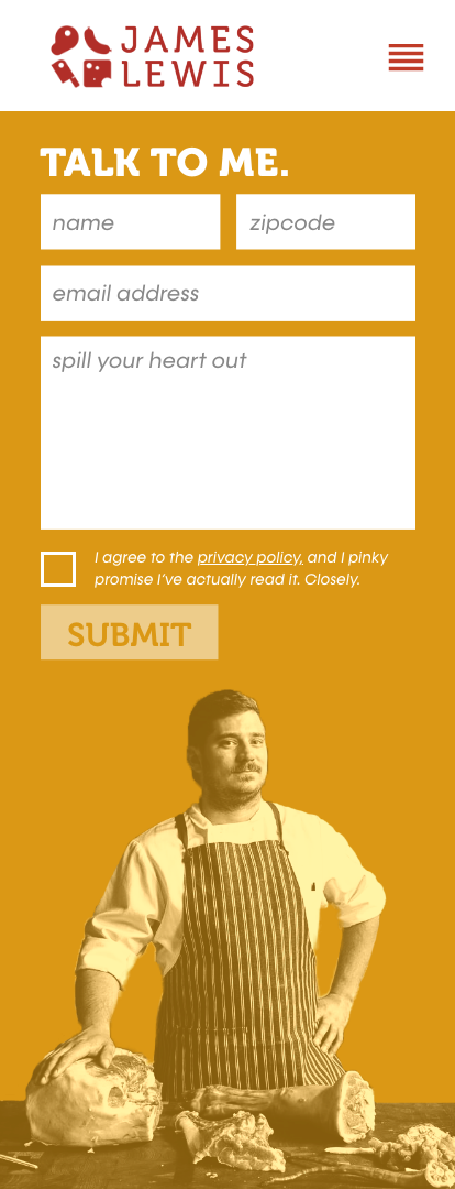
WEB
James Lewis' web presence is uniquely color-forward; each section of the site is duotone in one of the identity's four main colors. The menu lives vertically on the left side, unseparated from the main content area in the desktop version. Writing on the site is classically snarky.